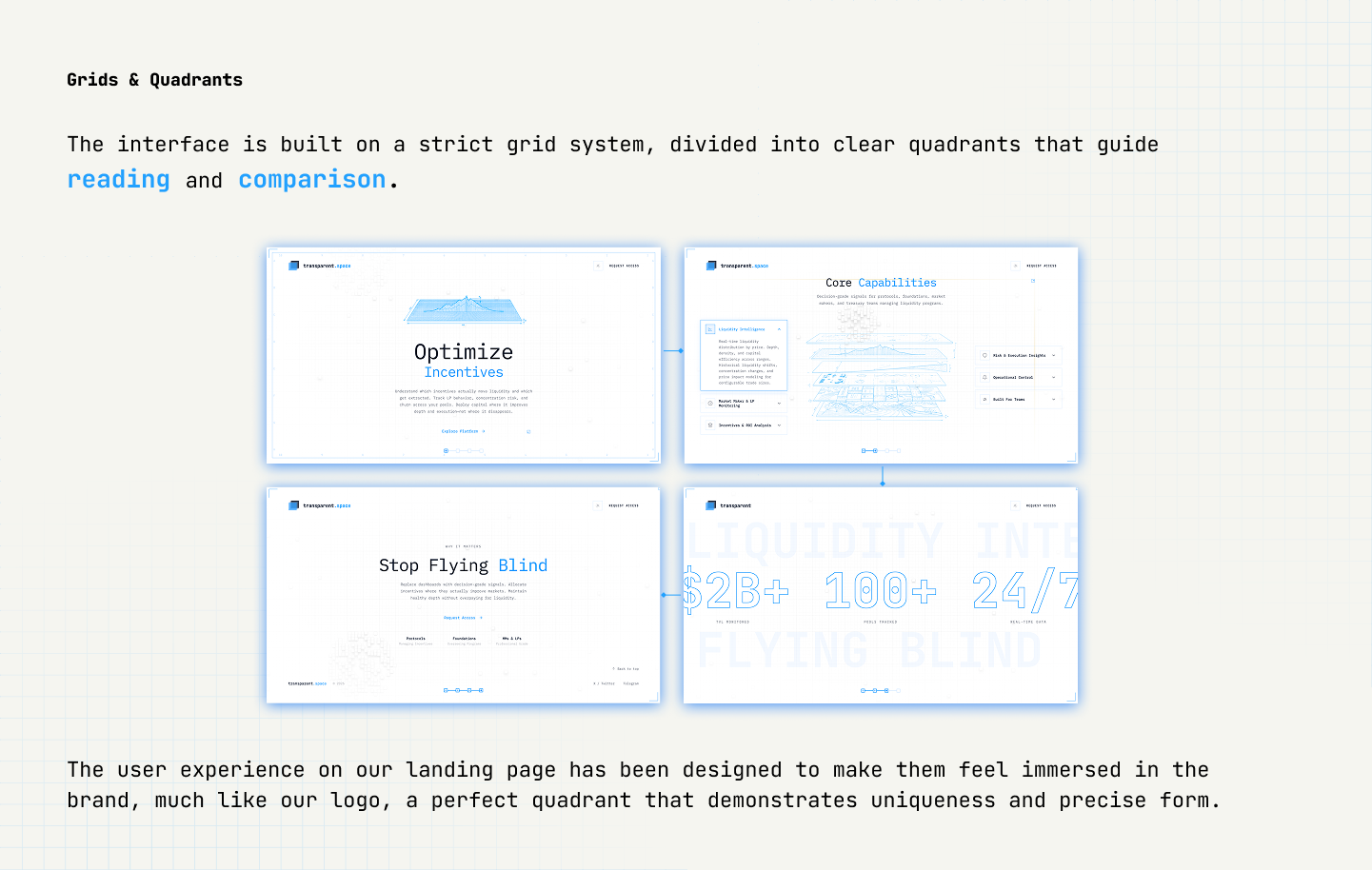
WEB3 · BRAND & VISUAL SYSTEM
Product logic and UX were defined, but the visual layer still read generic: blues, decorative gradients, charts with no hierarchy. The brand had to earn trust before anyone read a number.
Institutional users form a judgment in the first 3 seconds. If the screen looks like every other Web3 dashboard, the rigor behind the product never gets a chance to register.
In B2B Web3, credibility is visual first. A dashboard that looks like every competitor signals that the data behind it might be just as interchangeable.
The brand had to translate product rigor into visual trust, across product UI, marketing website, and partnership decks, without separate aesthetics per channel.
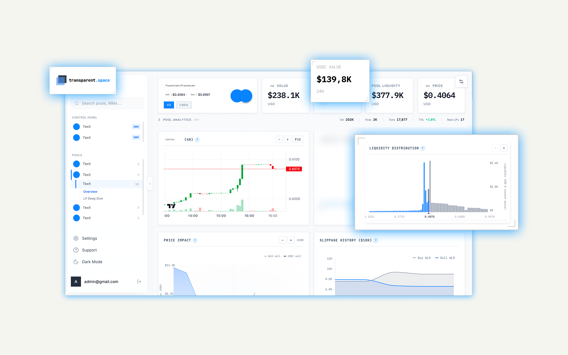
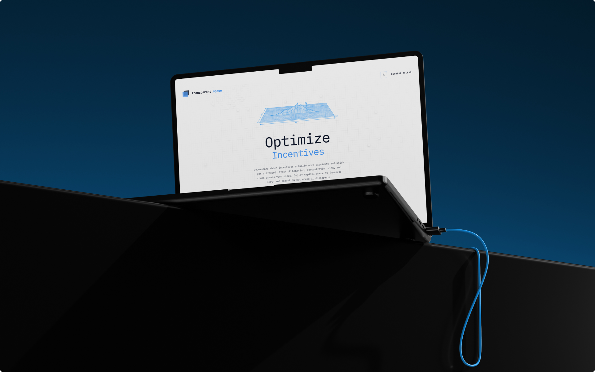
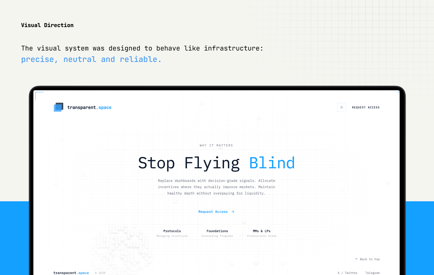
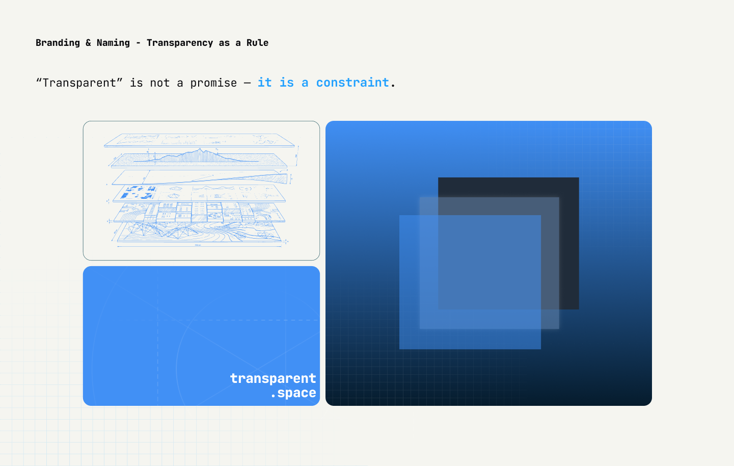
Owned brand identity, visual system, UI direction, and marketing website. One concept: blueprint, where every element exists to be measured and verified.
Light mode as default for institutional daytime workflows. Website built with CursorAI for motion at hackathon pace, used sparingly to reinforce the blueprint concept.
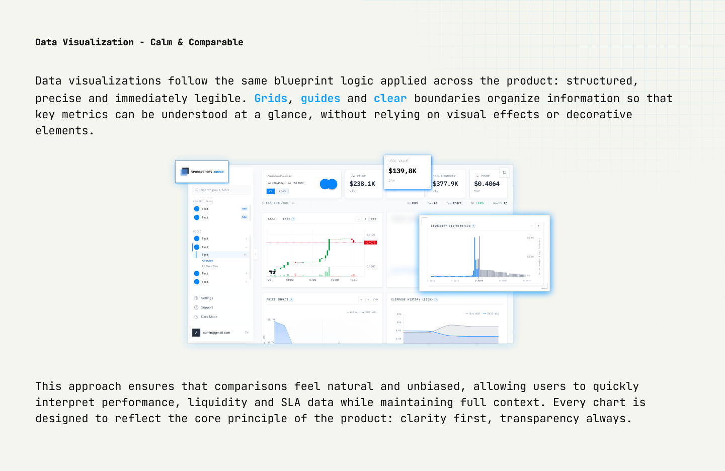
Visible grids, precision typography, functional color, zero decoration. Same system from dashboards to marketing. Whether someone opens the product, website, or a partnership deck, the trust signal stays consistent.
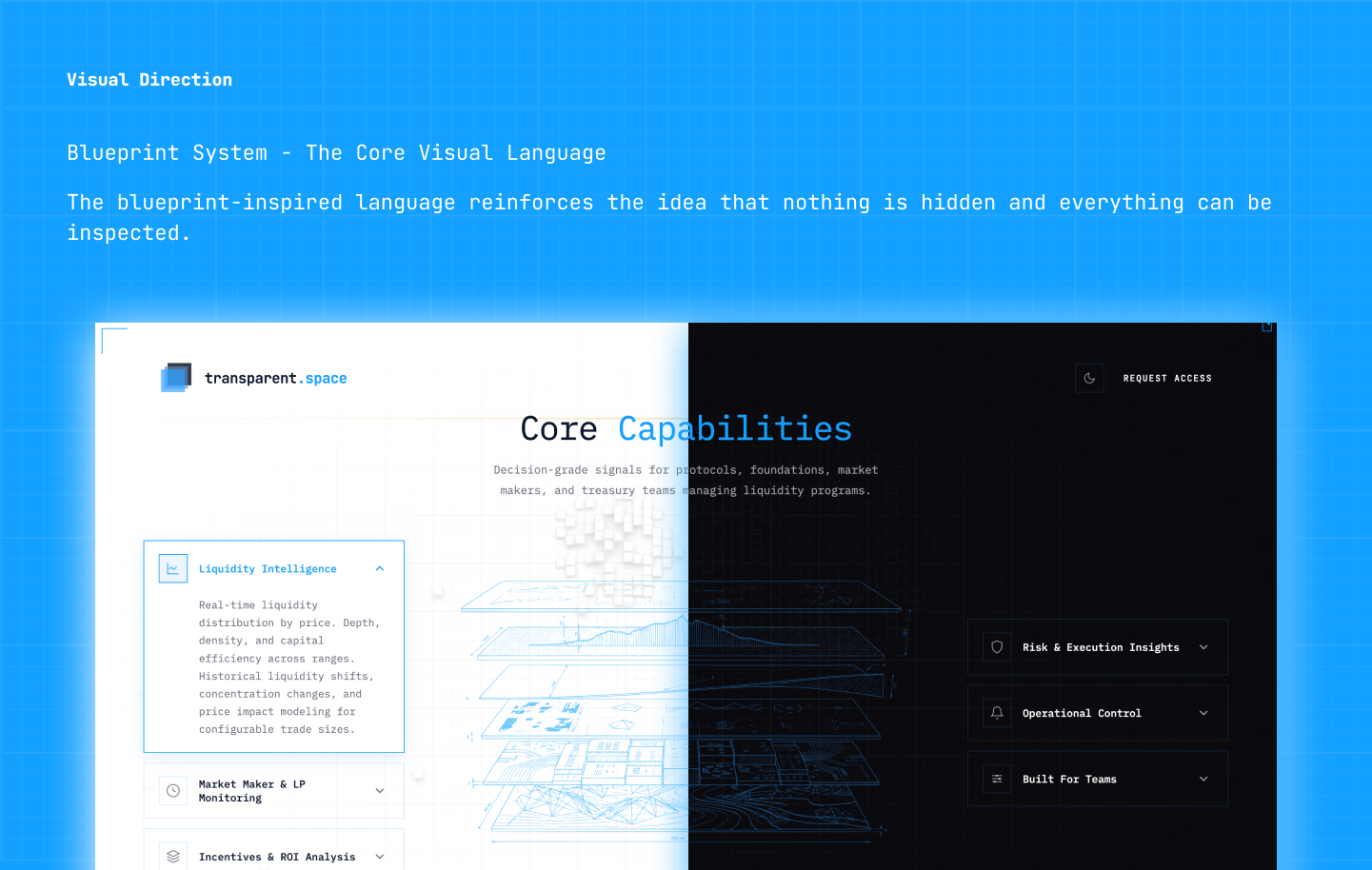
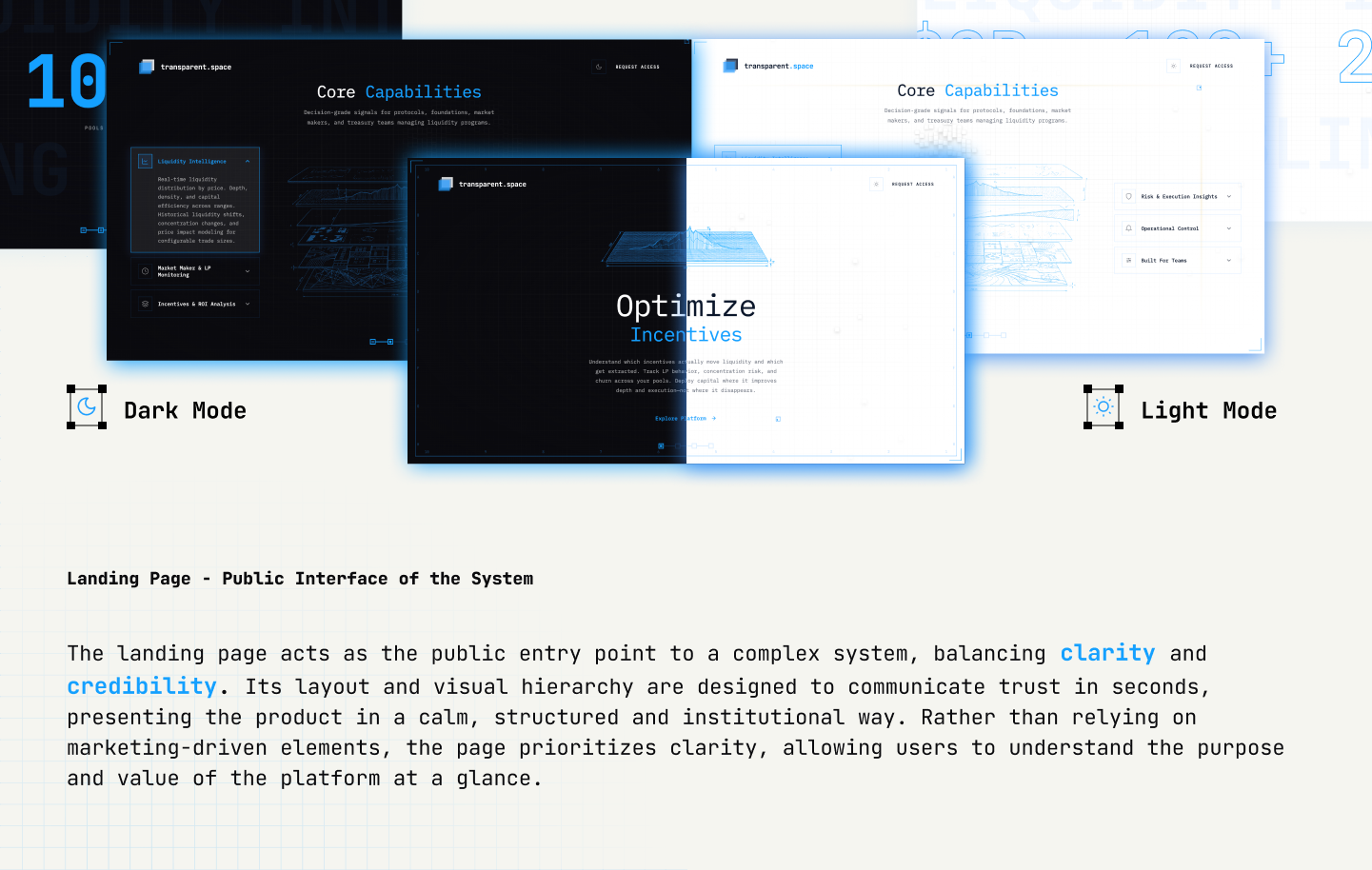

We considered dark mode like most Web3 products. Institutional operators work in daytime. We chose light deliberately: professional tool, better data readability.
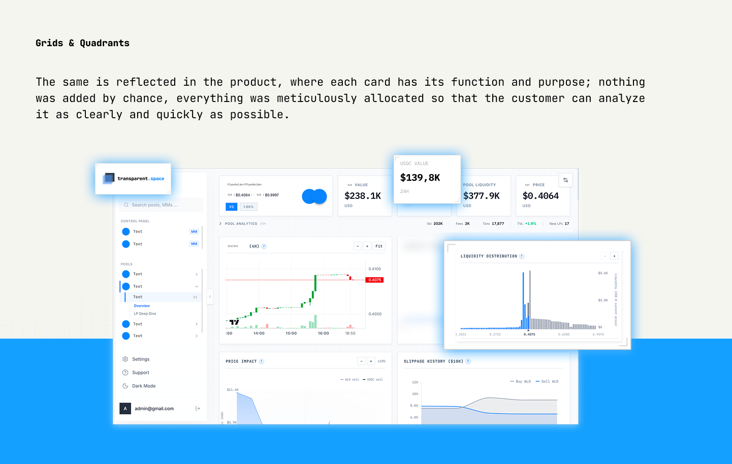
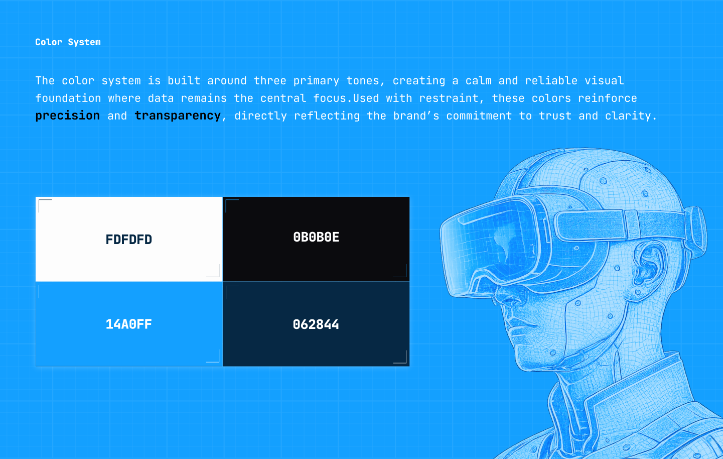
We considered multiple accent colors for visual interest. In data-dense environments, color creates noise. We chose one functional accent reserved for status signals only.
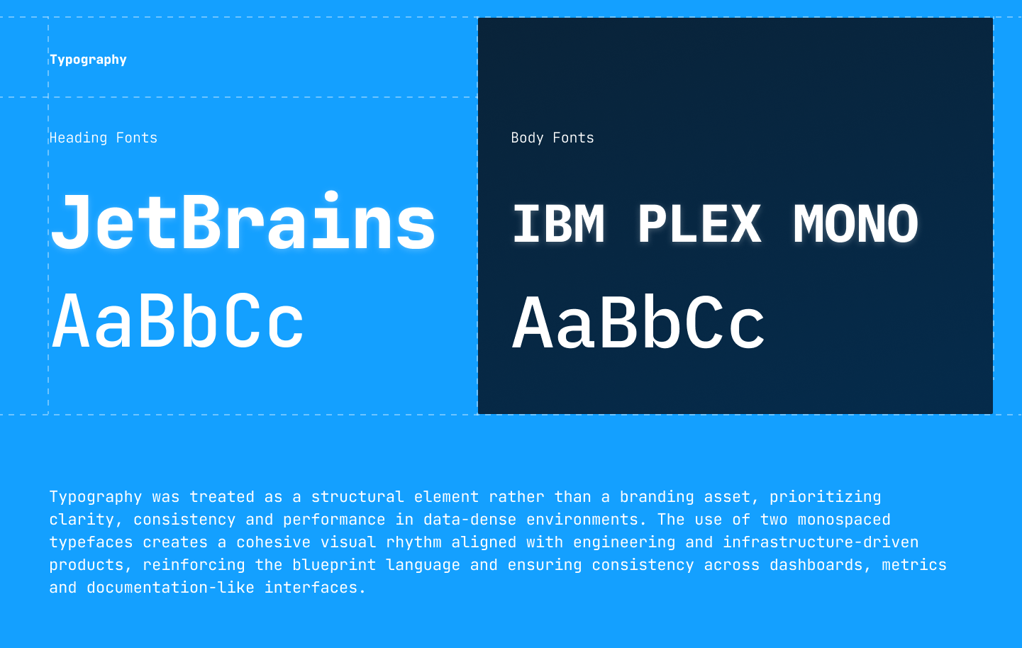
We considered headline-first type choices. Dashboard users scan columns at speed. We chose tabular figures and high x-height optimized for metric legibility.
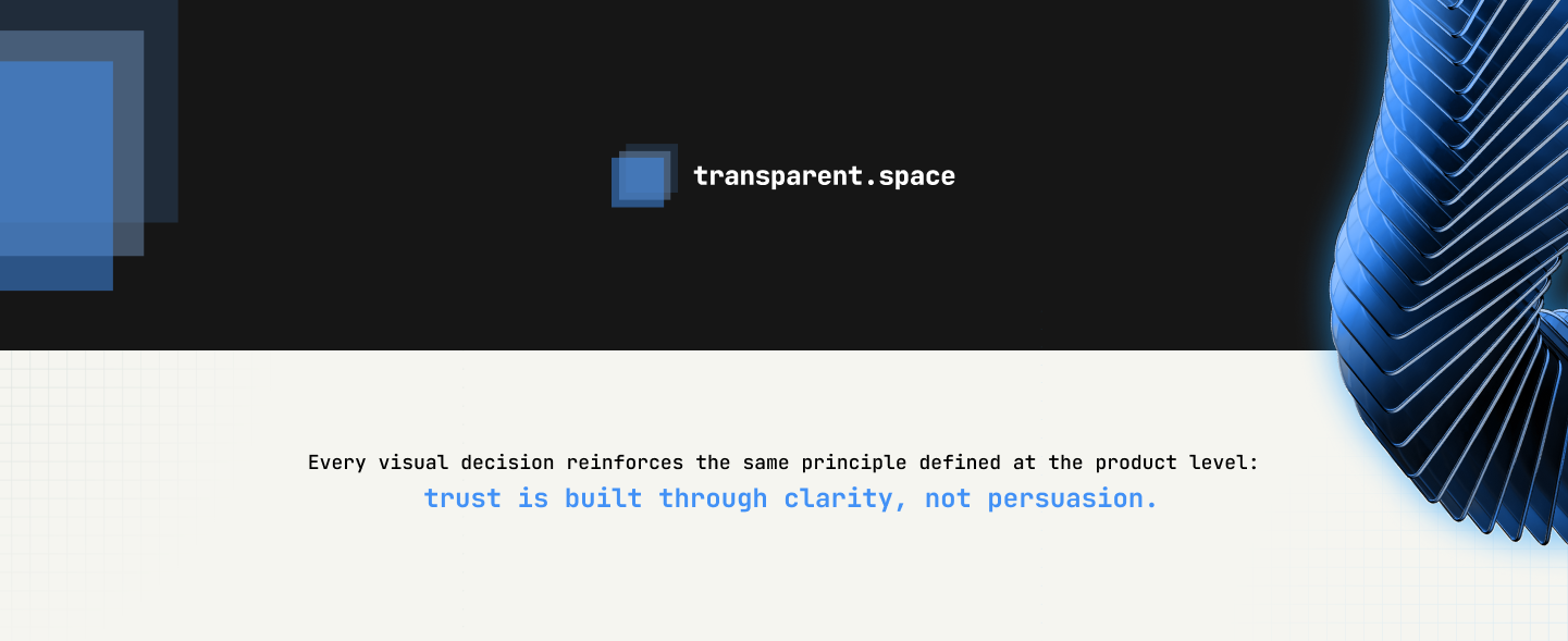
Brand system unified product, website, and marketing with one visual language across every surface. No separate aesthetics per channel: dashboards, marketing site, and partnership decks all read from the same blueprint system.
Visual system is ready for advanced analytics modules as the product scales. Early client feedback aligned institutional trust perception, a qualitative signal rather than published conversion metrics, but consistent across every touchpoint we tested.
Brand and product UI must evolve as one system. Every visual decision builds or erodes trust, especially when users decide credibility before they read a single number.
Next: Structured motion for live SLA changes; see the product write-up for UX and IA.