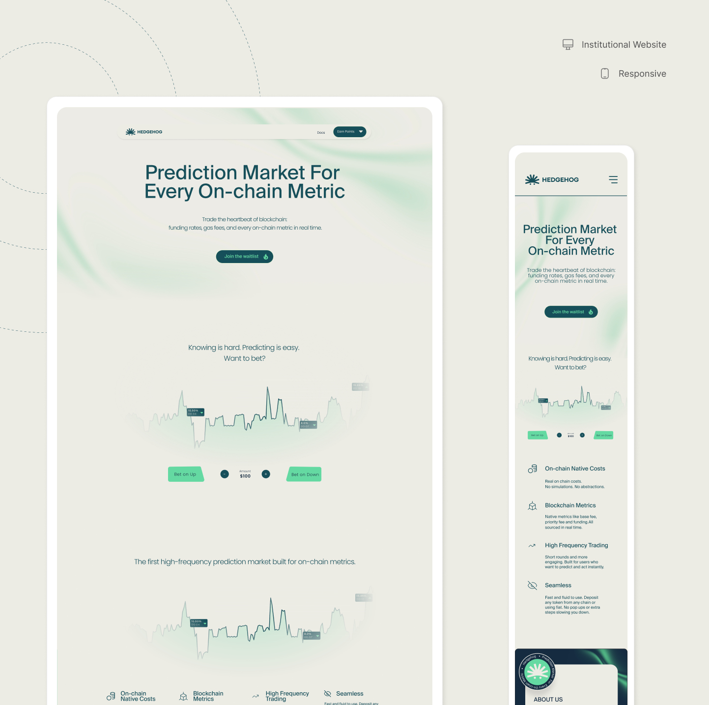
The first impression had to work before launch
Hedgehog needed to make the right first impression before the product even existed publicly, communicating enough institutional credibility to convert a professional audience that typically demands context and proof before leaving contact information.
Without a page that earned trust fast, there was no way to validate demand or build a qualified waitlist ahead of launch.
Hype doesn’t convert this audience. Clarity does.
The page’s target wasn’t the casual crypto user, it was an institutional and professional audience used to evaluating B2B and Web3 products before committing.
For that audience, hype doesn’t convert; clarity and proof of solidity do. Without this page working, there was no way to validate demand or build a qualified list before the product’s launch.
Conversion-first references, not long narratives
References came partly from stakeholder recommendations and partly from independent choices: Sonic Labs (the rebrand of the former Fantom), Hyperliquid, and Aave, among others.
The pattern across all of them was clear, strongly conversion-oriented, without building a long narrative before asking for action. Hedgehog’s landing page inherited that same logic: direct conversion triggers from the first scroll, without trying to convince the user through an extended journey before the CTA.
The institutional tone wasn’t discovered along the way, it was a decision made with clarity from day one, built together with marketing and the founders.
Three layers: understand, trust, act
The page was structured in three layers, guiding the user from understanding → trust → action. Copy was built with marketing and the founders to speak directly to the audience the company already had and wanted to reinforce.
01
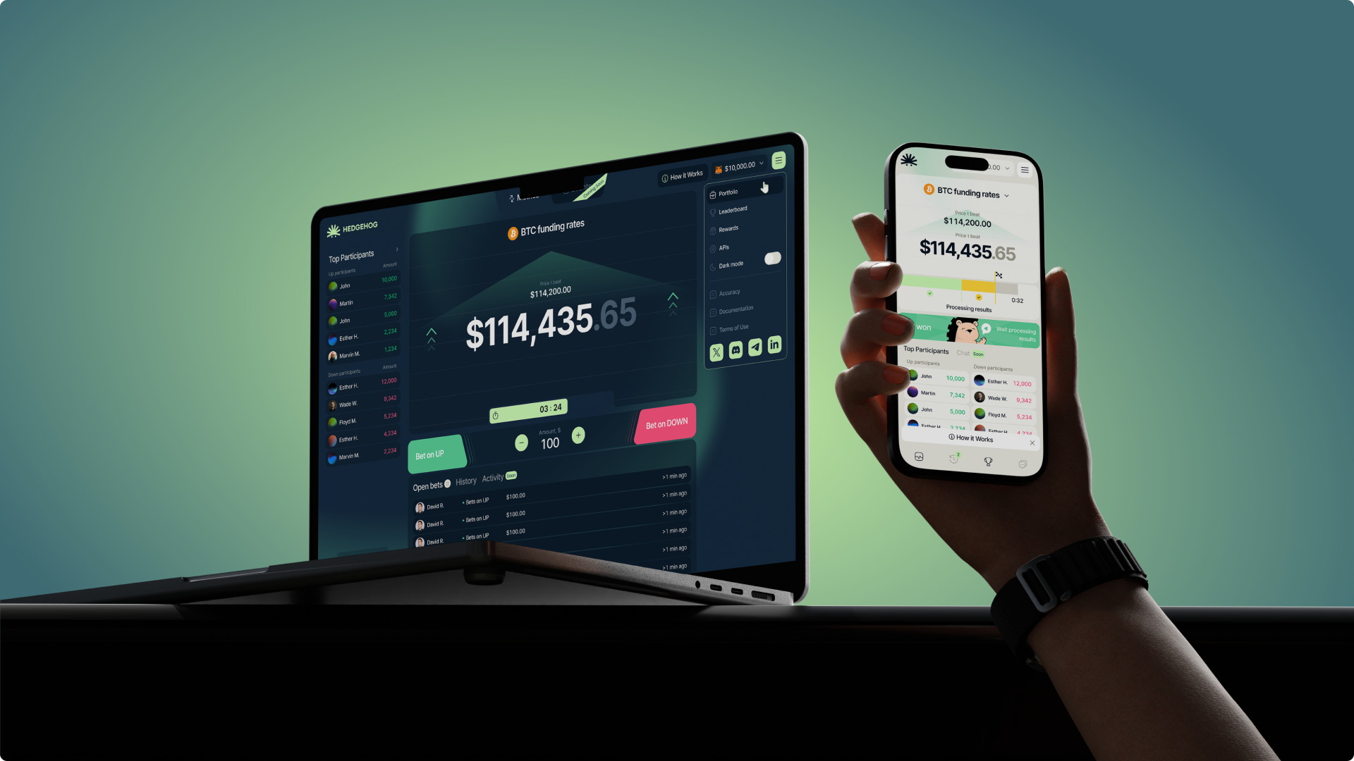
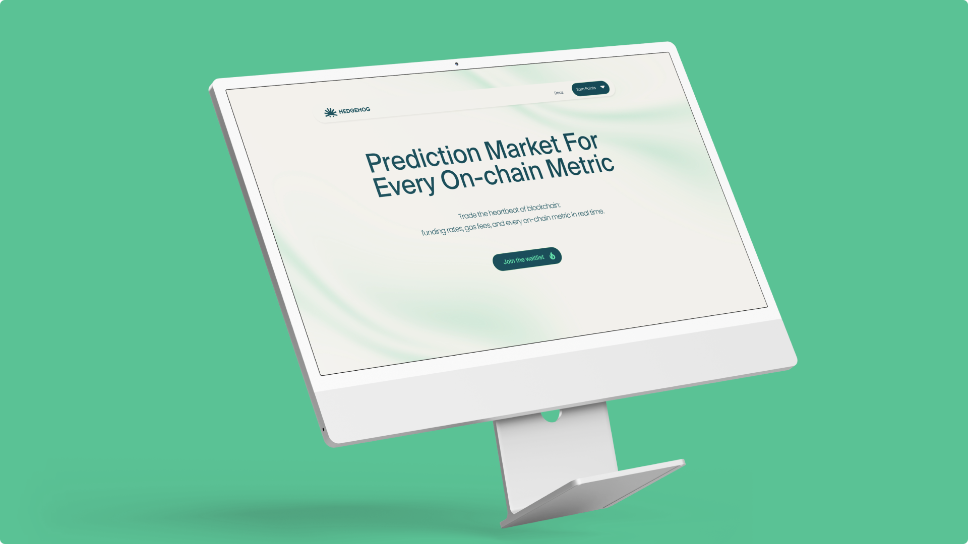
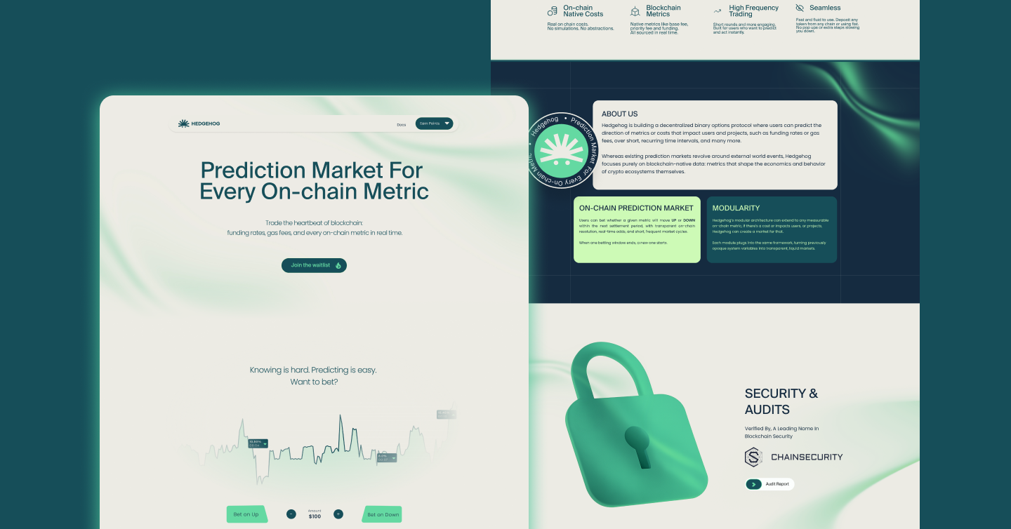
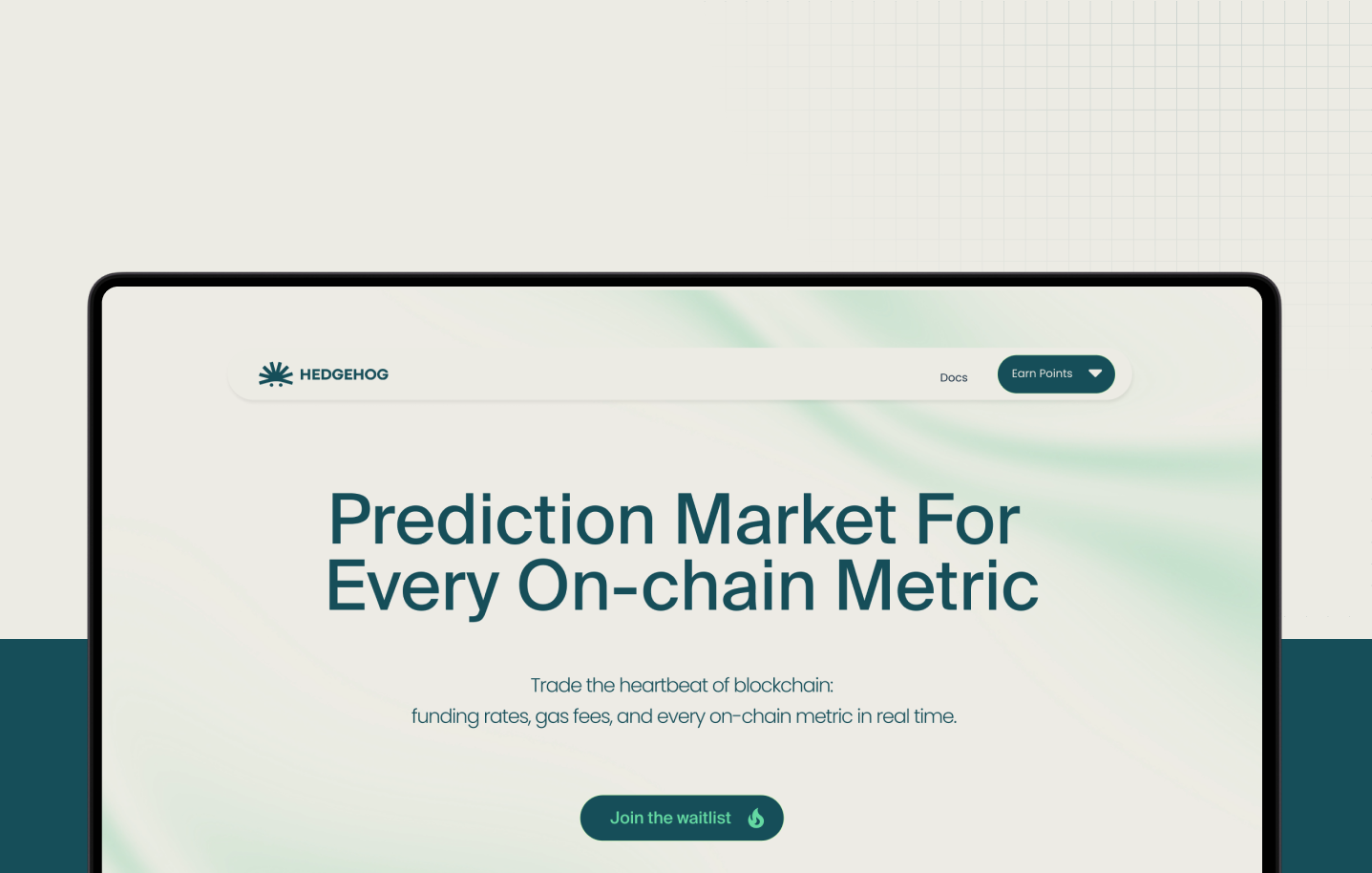
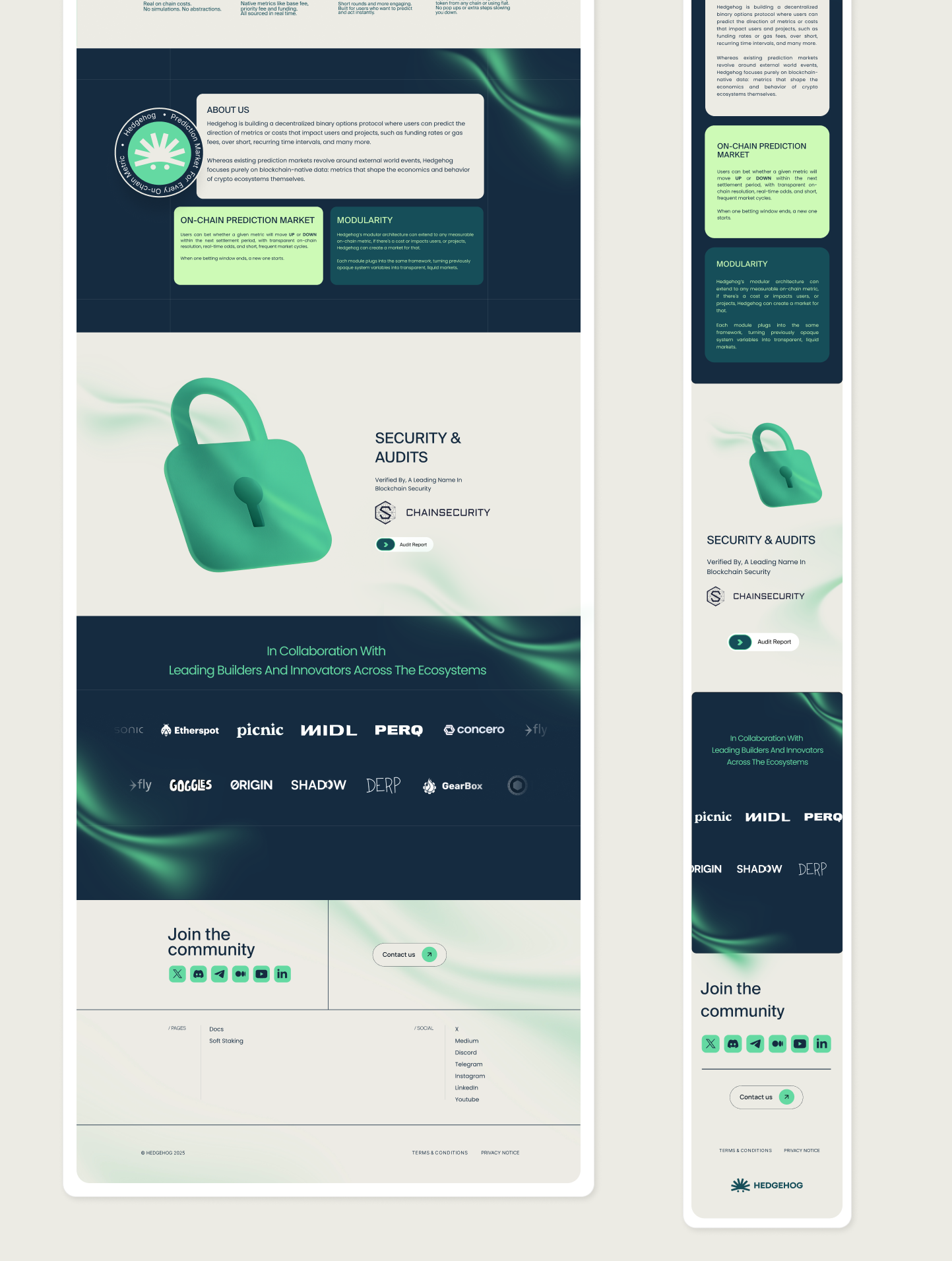
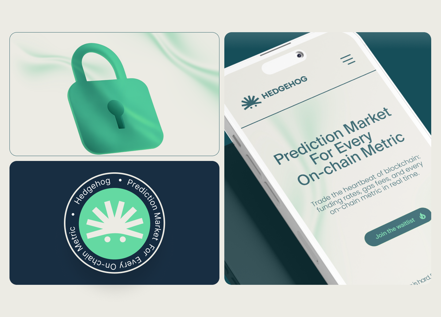
Hero, value signal + immediate action
Clear value proposition, institutional tone, “Join Waitlist” CTA above the fold. No hype, no premature product mockups, concept visuals that signal seriousness without overpromising.
02
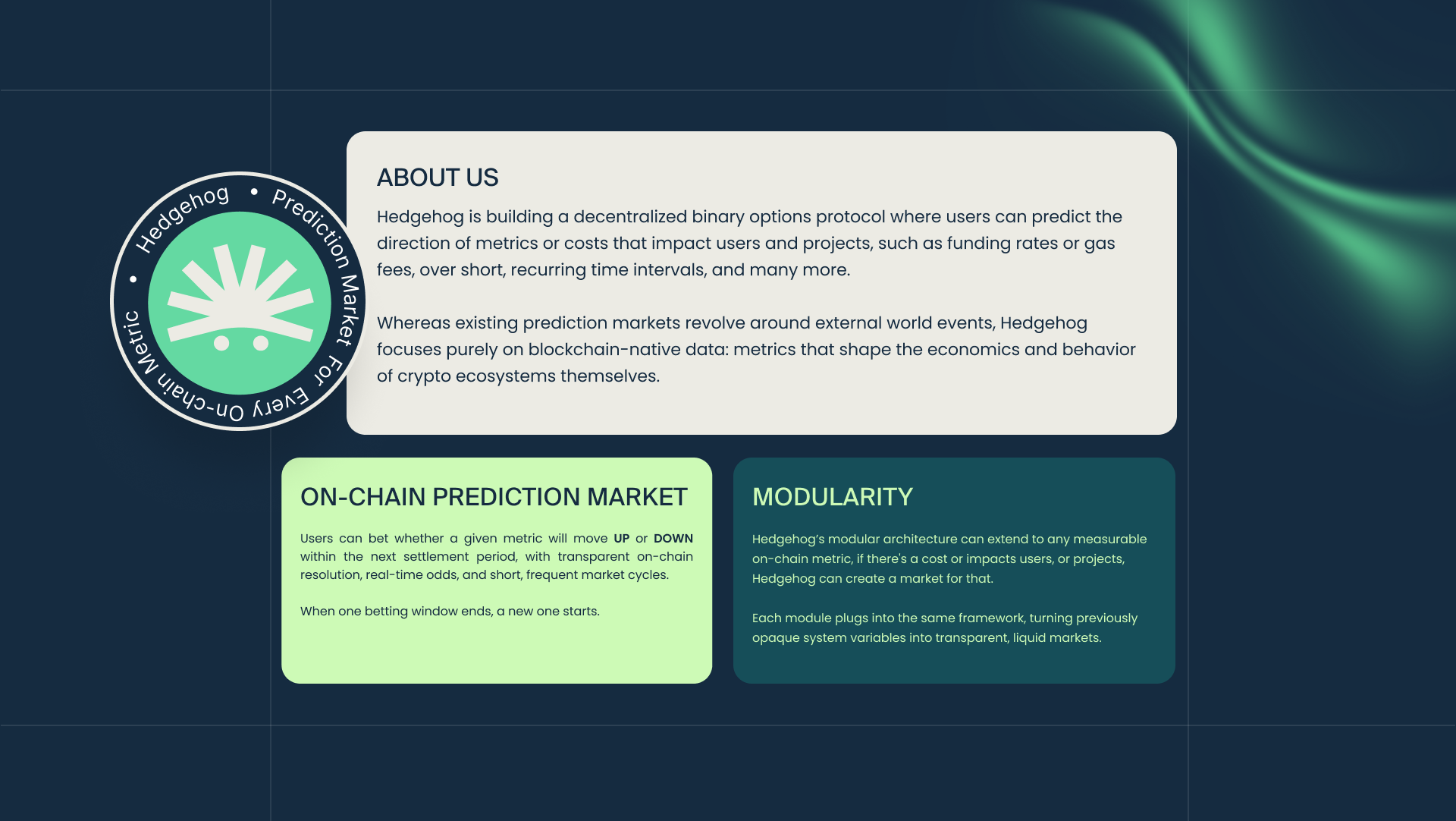
Trust & context, credibility layer
Problem framing aligned with the user’s reality. On-chain-focused differentiation, sections on reliability and governance, the questions institutional users ask before they trust a pre-launch product.
03
Action reinforcement, conversion loops
Repeated CTAs with microcopy evolving from awareness to intent. Social proof, mechanics explained enough to believe, not audit, and a secondary CTA in the footer to close at peak scroll depth.
Community engine in parallel: active presence on X and Telegram driving organic traffic, games and trivia on Discord for constant engagement, and a USDC mission system, users completing tasks earned USDC, creating a loop where each active participant brought in more people.
Aligned before launch. Proven in production.
There was no formal usability test or A/B test before launch, real validation happened live, in production, with the actual audience.
What did happen before launch was an internal alignment process: copy was built together with marketing and founders specifically to make sure tone and message were accurate for the audience the company already knew. That upfront clarity on tone and audience significantly reduced the risk of missing the mark on communication.
The real validation came afterward, in actual conversion behavior, not in a lab.
15,000+ sign-ups. Zero paid traffic.
37.5% conversion from organic community visitors (benchmark: 2 to 8%). 15,000+ waitlist sign-ups with $0 paid acquisition across X, Telegram, Discord, and Web3 networks.
- Conversion engine: page designed for direct action, amplified by community on X/Telegram, Discord engagement, and USDC missions
- CTA consistency: sustained engagement across primary and secondary conversion points
- Product pipeline: the same user base generated by this page later fed the product’s beta, results detailed in the Hedgehog Product case
Test what wasn’t tested before launch
Formally test headline and CTA variations through A/B testing, something that wasn’t done before the initial launch.
The page was validated in production, directly with the real audience, without prior split testing. The next iteration is bringing structured experimentation to the highest-leverage copy on the page.
In institutional contexts, conversion comes after trust, not before. Restraint on the page, paired with a live community engine, was the strategy that made 37.5% possible without paid spend.