Evaluating a Market Maker is harder than it should be
Web3 institutions depend on Market Makers to maintain liquidity and market efficiency, but actually evaluating a Market Maker’s real performance is surprisingly hard.
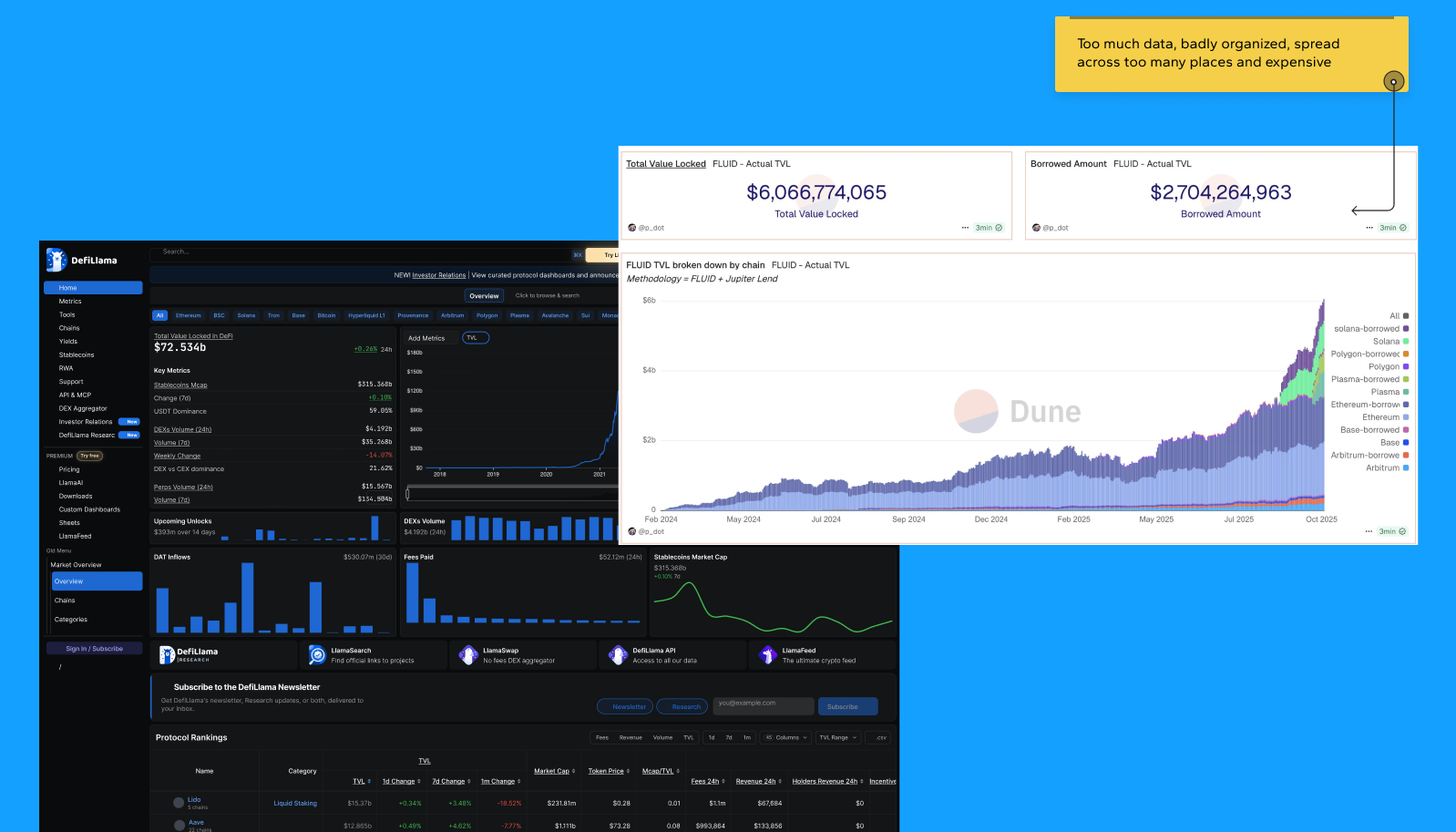
Tools like Dune and DeFiLlama, among other solutions on the market, are expensive, fragmented (data isn’t all in one place), and in some cases don’t even let you index the exact information an institutional client needs.
When the decision involves real financial risk, including whether or not to apply a contractual penalty to a Market Maker, you can’t rely on scattered or partial data.
Two audiences. Opposite needs. One decision.
Two audiences depend on the same data with opposite needs: institutional funds, DeFi protocols, and exchanges, who need to decide fast and trust the data without a technical background, and the Market Maker teams themselves, who need to prove SLA compliance.
At the center of this is a high-stakes decision, when a Market Maker steps outside what was contracted, someone has to decide, with reliable data, whether a penalty applies.
Getting that decision wrong costs real money, on both sides.
Insider context, then conceptual benchmarking
The research had an edge few projects have: the Product Manager had years of experience as a data analyst, which gave the team direct access to the market’s real pain point, not just an outside read of it.
The CEO, for his part, had already been living with this problem for a while before the project even started. That business knowledge was cross-referenced with conceptual benchmarking, Dune, DeFiLlama, Bloomberg Terminal, Grafana, and Datadog, to understand how each type of tool handles dense financial data.
The pattern was clear: existing solutions are expensive, fragment data across multiple tools, and don’t always let clients index exactly what they need. The product’s core goal came directly out of that gap, unify everything into a single platform, charged at a fair price, with fully personalized contracts: every pool a client requested was designed and indexed to spec, clear enough to prevent monetary loss or an incorrect penalty decision.
Four UX decisions that shaped the product
Four core UX decisions shaped the product, each tested against an alternative. The goal behind all of them came straight from the research: drastically cut the time a user needed to verify a data point and decide whether a penalty applied.
01
SLA as a binary contract, not an isolated percentage
“98.7%” doesn’t answer the question that actually matters: is this provider in compliance or not? The interface treats SLA as met or not met.
02
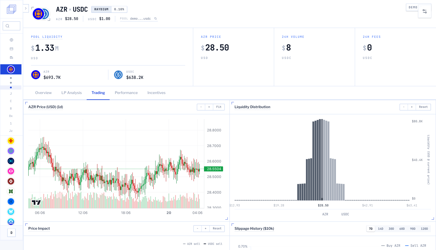
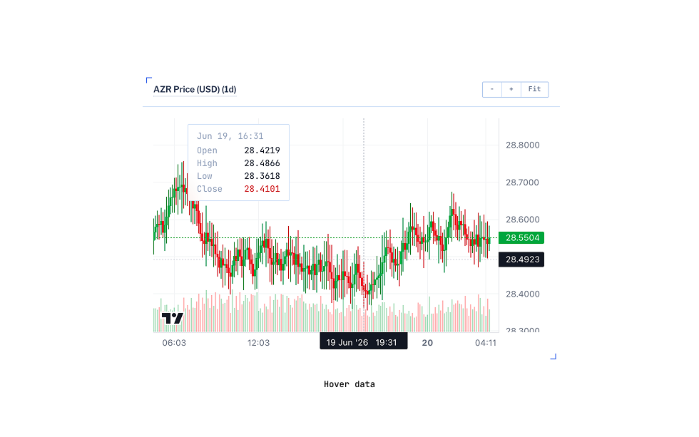
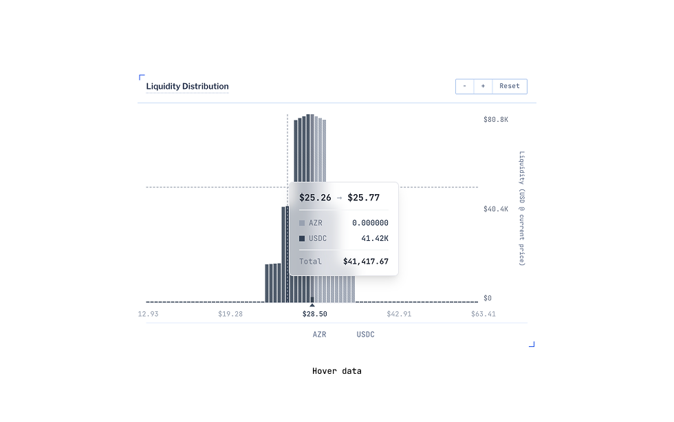
Liquidity as behavior over time, not a static value
A $200K pool may have dropped 60% in the last week, showing only the current value hides exactly what matters most for the decision. Trend and direction come first.
03
Sidebar context and filters, always within reach
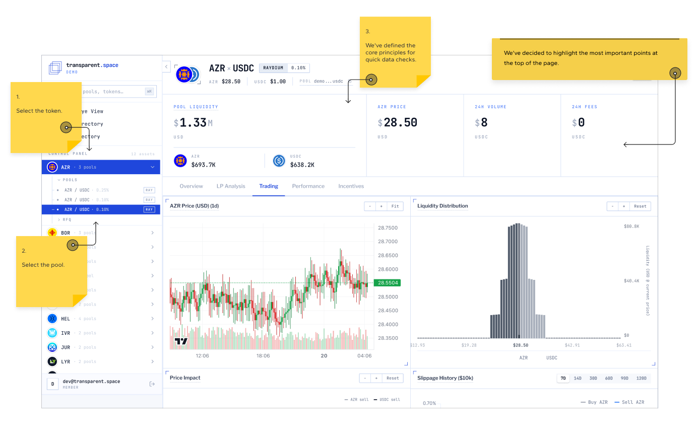
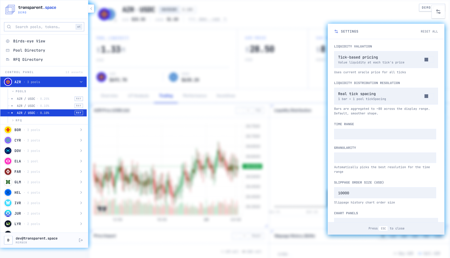
Operators monitoring multiple pools under personalized contracts need orientation without leaving the main view. The sidebar carries contract metadata, pool context, and reference info; filters narrow by pool, timeframe, and SLA state so each session starts scoped to what matters.
04
A single-screen mental model
Information organized into four layers, SLA status, liquidity behavior, market comparison, and methodology, with progressive drill-down that never loses context.
Automatic alerts flag when any data point crosses an expected threshold, removing the need for manual monitoring. A product this complex was only achievable within the project’s timeline because of AI-assisted workflows, they compressed delivery time and opened up far more room for iteration, especially for testing layout variations quickly instead of manually rebuilding each option.
Multiple rounds with operators, then production clients
Usability sessions ran with 4 operators, across multiple rounds throughout the entire project, not a single session. The team combined this with several fast A/B tests, deliberately kept lean in execution time to avoid stalling the timeline, until reaching the final version aligned with what the stakeholder needed.
These rounds identified “too many simultaneous metrics” as the main friction point in v1, the main screen was reduced from 12 metrics down to 4 critical ones, with the rest available through drill-down.
After launch, the strongest validation came from real usage by the product’s two main B2B clients, Worldchain and Kraken, detailed in the impact section below. The full project, from kickoff to delivery, took an average of 6 months of direct work.
Measured outcomes and institutional traction
Task completion · 4 operators, multiple rounds
Time to check a data point · client-reported
Components · ~35% faster handoff
Across test rounds with the 4 operators, task completion went from 61% to 88%, a consistent directional result across the process, not a large-sample statistical test, but validated repeatedly with the same group over multiple rounds.
- Production validation: Worldchain and Kraken operate today as real clients, with personalized contracts and multiple pools monitored 24/7, validating institutional product-market fit in practice
- Client-reported speed: cross-referencing data manually across platforms used to take ~20 minutes; inside the unified platform, checks dropped to under 30 seconds (qualitative account, not a controlled measurement across all users)
- AI-assisted delivery: design cycles sped up by ~60%, enabling far more layout variations tested within the same 6-month timeline
- Metric discipline: main screen cut from 12 simultaneous metrics to 4 critical ones, with depth behind drill-down
From reactive monitoring to predictive decisions
The platform answers “is this Market Maker in compliance right now?” The next layer is answering “will it still be in compliance tomorrow?”
Priority directions: predictive alerts before thresholds are breached, and expanded neutral comparison for up to three Market Makers on a single view, without reintroducing the leaderboard bias we deliberately removed.
In institutional products, restraint is the strategy. UI simplification without IA simplification just shifts confusion to a different screen. Every metric we removed from the main view had to earn its way back through drill-down.