HEALTHCARE · TELEMEDICINE
Remote care was becoming a necessity, but the experience available on the market wasn’t ready for it, generic apps, lacking the specific experience a large institutional healthcare audience needed, with accessibility barriers and fragmented scheduling.
40,000+ beneficiaries of Brazil’s largest health cooperative, with widely varying digital literacy, Unimed itself had flagged to the team ahead of time that a significant portion of that base was made up of beneficiaries aged 60+, which shaped the extra care around clarity and support from early on.
These beneficiaries needed to trust that a remote consultation would “actually work when I need it.” In healthcare, the barrier isn’t just usability, it’s trust. A flow that raises doubt makes someone give up and seek in-person care instead, exactly what the product was meant to prevent.
The company was already an established healthtech, so the team didn’t start from zero, there was already a persona study built from multiple interviews with real users over time, which had produced well-defined patient profiles.
When Unimed Seguros contracted the service bundle, the work was to refine that existing study around Unimed’s specific audience, rather than starting new research from scratch.
There was no benchmarking against other health apps, the company itself was the reference, given its accumulated product experience in the space. This project took place in the middle of the pandemic, and the core goal was to get a patient through a consultation as fast as possible and into the right referral, not a convenience goal, but literally about shortening the gap between “I have a symptom” and “I have the right guidance.”
The pattern that showed up, both internally and observed across other companies in the sector during the same period, was the broader pandemic scenario itself: real chaos and an urgent search for help. This wasn’t an abstract usability pain point, it was the emotional context of everyone opening the app.
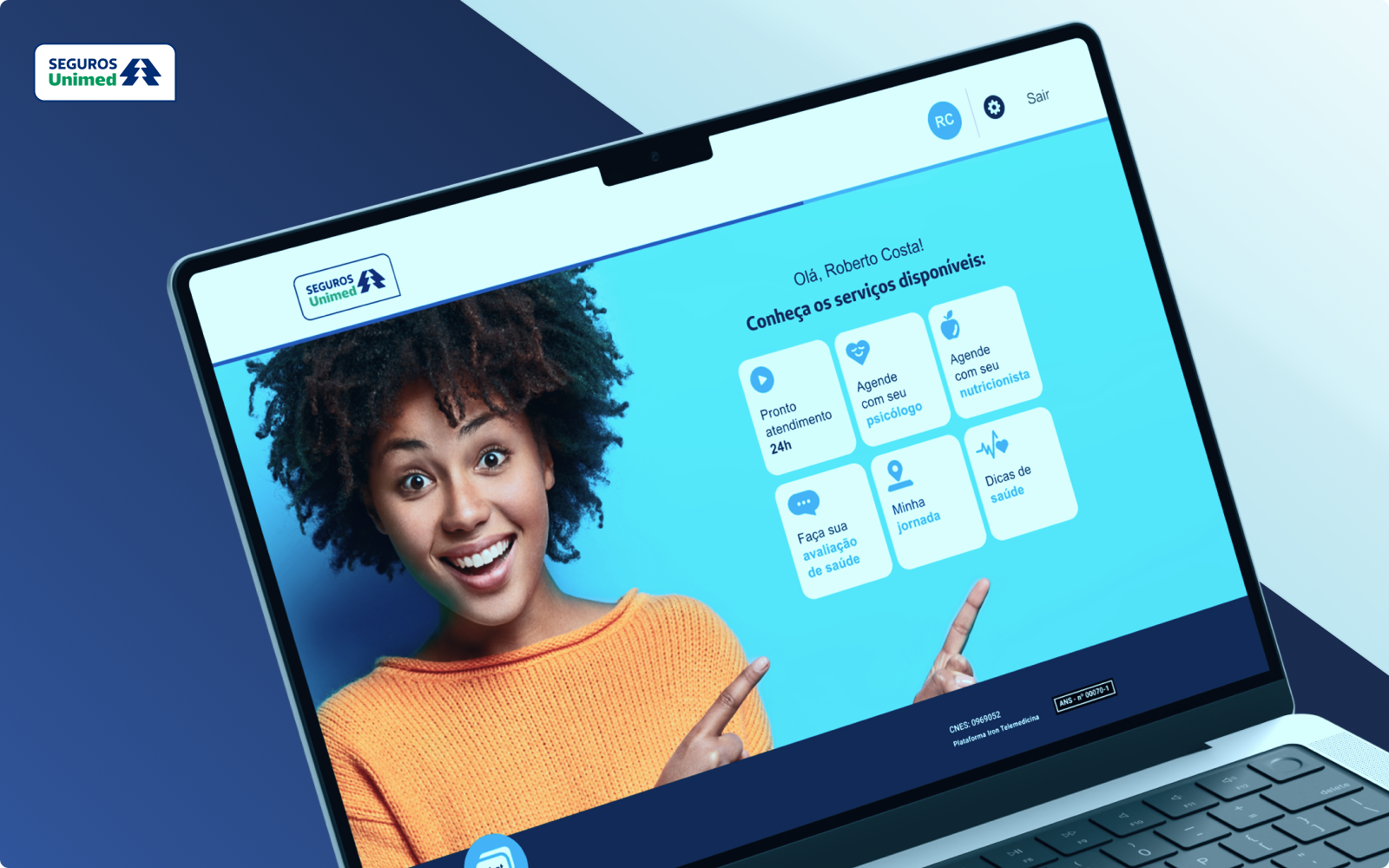
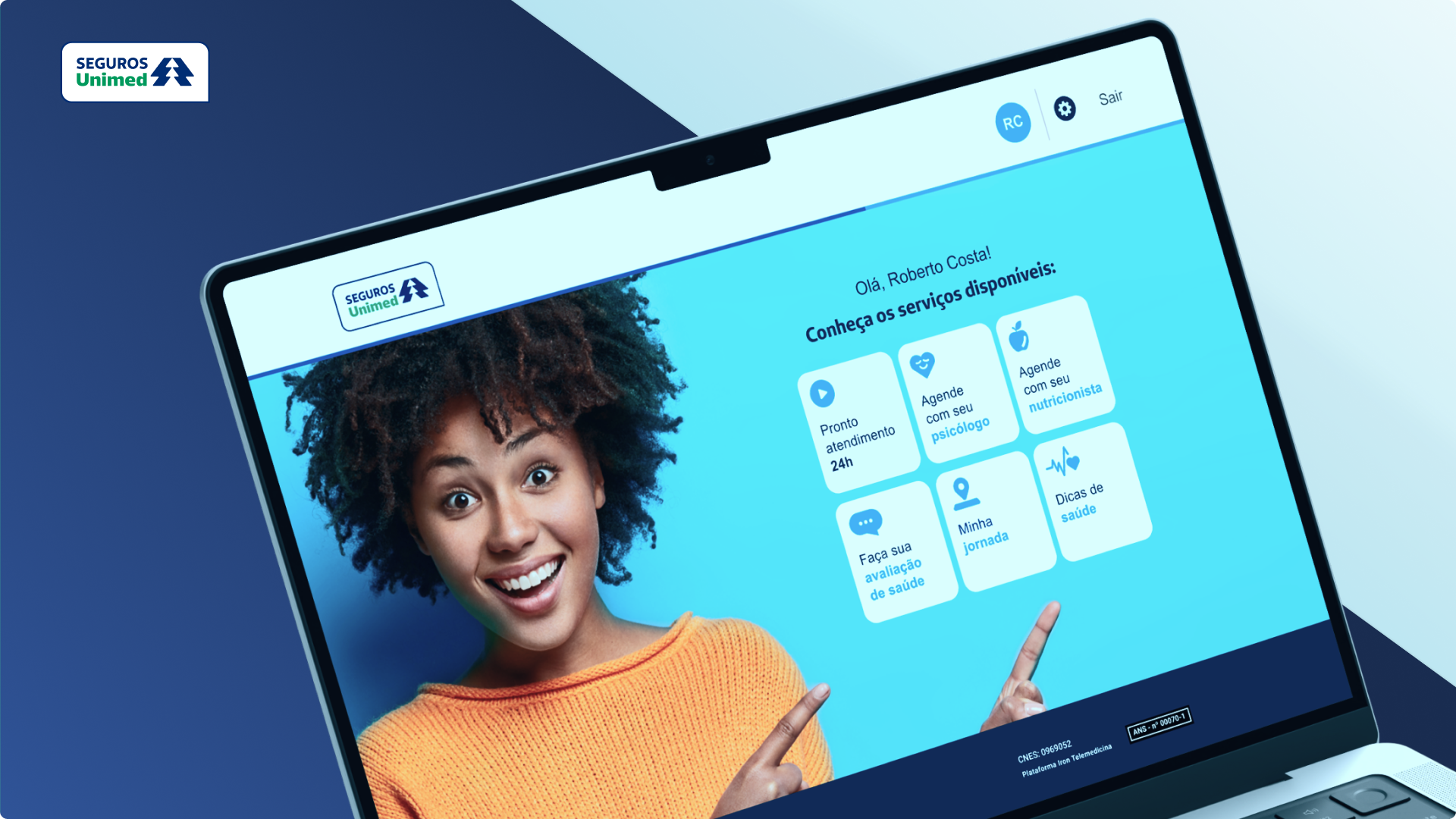
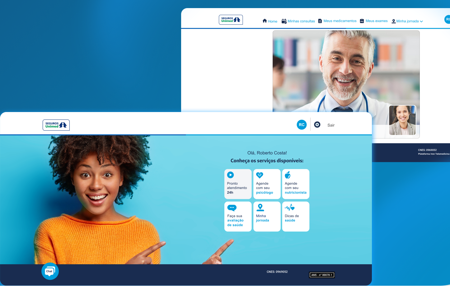
The app was structured around four pillars, guided by three decisions: clear next steps instead of an overload of options, institutional trust through visual restraint (neutral colors, accessible typography), and predictable guidance at every step of the flow.
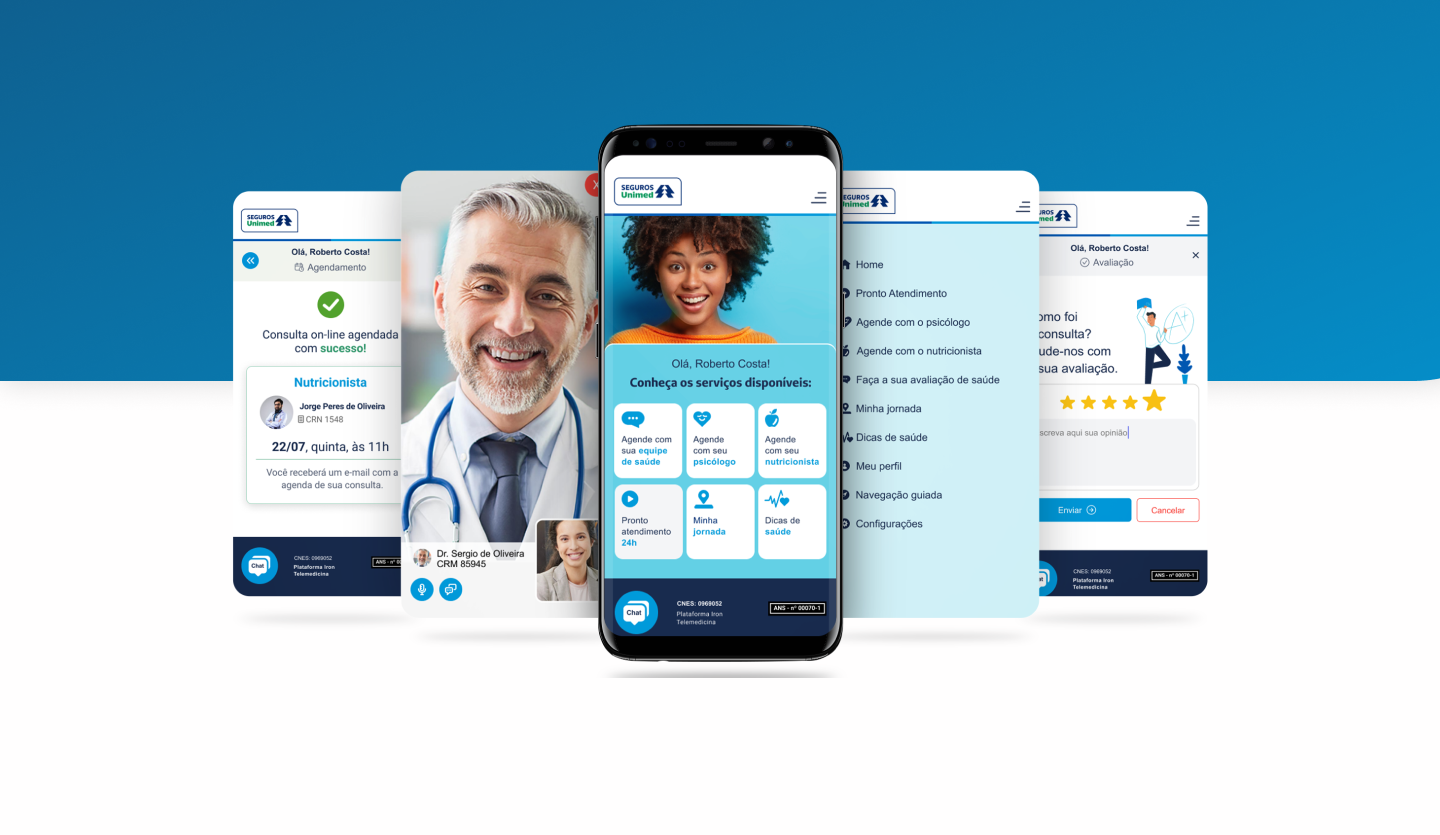
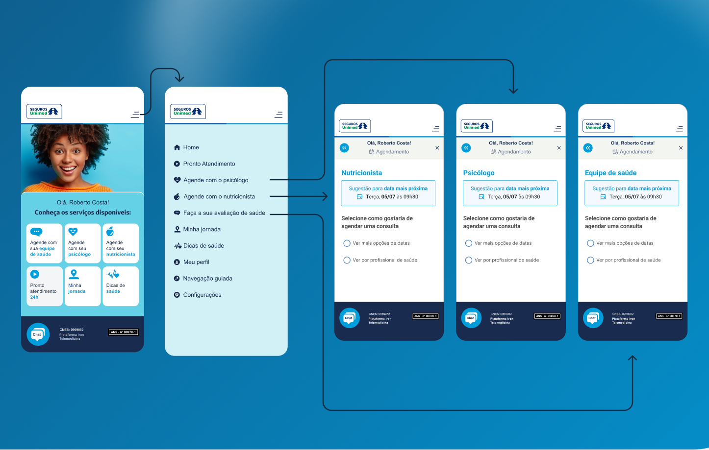
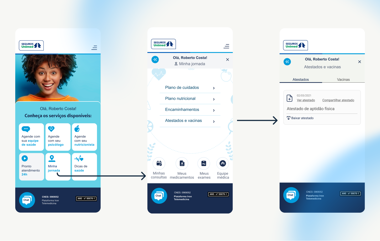
From symptom description to confirmation, one guided path with a clear next step at every screen, built for users who may be anxious and unfamiliar with telemedicine.
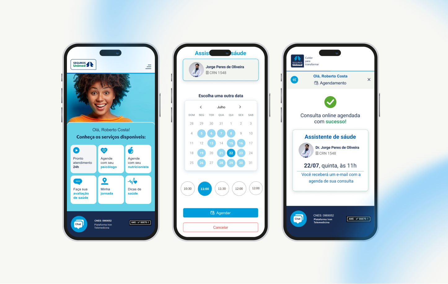
Video and chat with a healthcare professional, the moment trust matters most. Referrals, when needed, happen directly during the consultation, with no extra step or redirect to another channel.
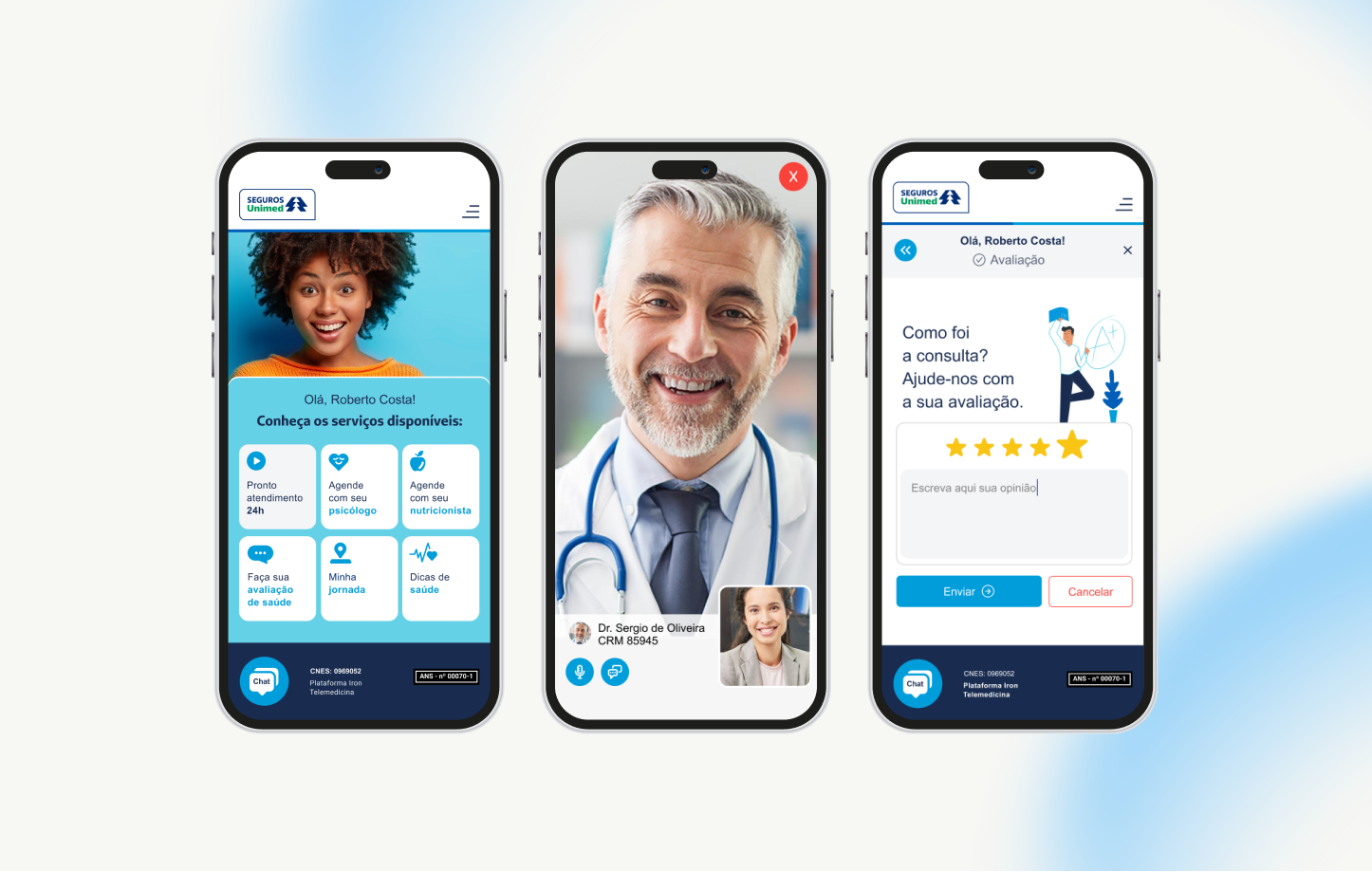
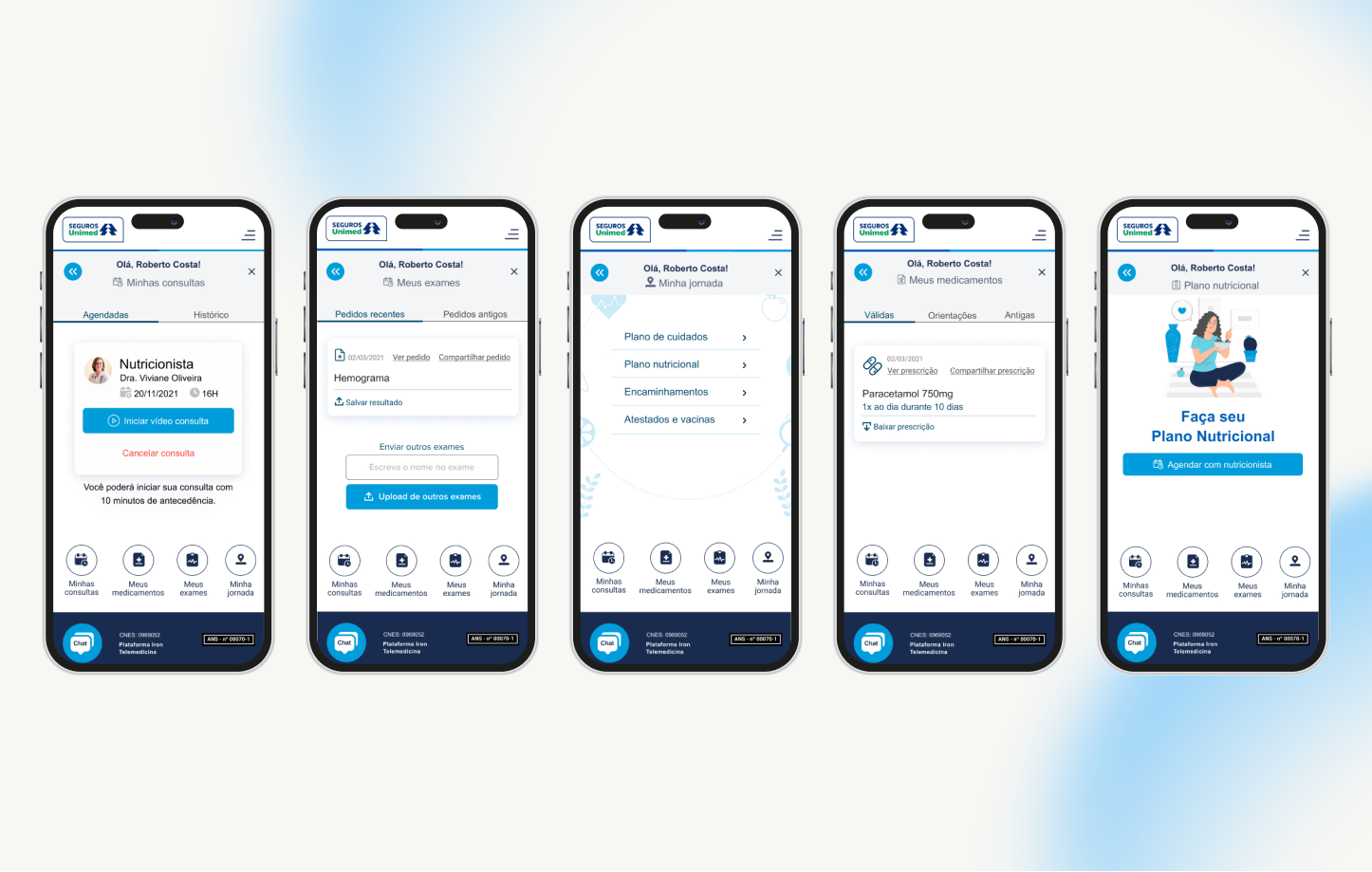
Past consultations, recommendations, and guidance in one place, so follow-up doesn’t require navigating a maze of disconnected screens.
When almost no one could leave home, the app became the access point for medical orders, prescriptions, medical certificates, and other assistance. Beneficiaries access medicines and documents through a clear, guided path, without hunting across channels or calling support.
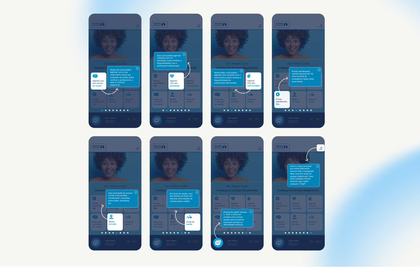
Since a significant part of the audience was beneficiaries aged 60+, the team went beyond the interface. A full product onboarding was built exclusively for Unimed, highlighting each function, permanently available on the platform, not just on first open. The 24/7 in-app chat worked as an additional layer of retention and support, and explanatory materials were made available to staff and support agents so human help stayed aligned with the same simple language used in the product.
Validation for this case didn’t come from a formal usability test run with Unimed, it came from an already-established foundation. The product had already been through its “trial by fire” with a previous client, so the core (flow, architecture, language) was already validated in production before Unimed came on board.
The work specific to Unimed was building new services and features on top of that proven foundation, like the dedicated onboarding, tailored to their specific audience and contract, without needing to rebuild from scratch or revalidate what had already proven solid with another client.
Validation for these specific pieces came from real production results, detailed in the impact section below.
Consultation volume reached approximately 50,000 per month, an unusually high number, especially considering the pandemic period the product was operating in. The app became the access point for medical orders, prescriptions, medical certificates, and other kinds of assistance when almost no one could leave home.
In health products, every ambiguous scheduling step adds stress; every clear next step keeps people in the flow. The priority ahead is real-time appointment status and integrated health records across consultations, so trust extends beyond the first visit.
When beneficiaries aged 60+ are learning telemedicine for the first time, the interface is only half the product. Onboarding, chat, and aligned human support are what make remote care feel like it will “actually work when I need it.”