FINTECH · BRAND IDENTITY
Picnic eliminates hidden fees from international spending, but without a visual system, social, campaigns, and in-app graphics each got interpreted differently. The challenge: approachable and fresh, with fintech credibility, not corporate blue.
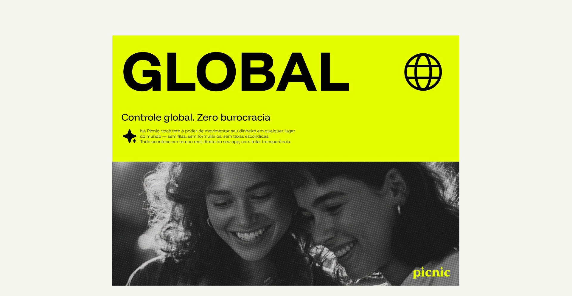
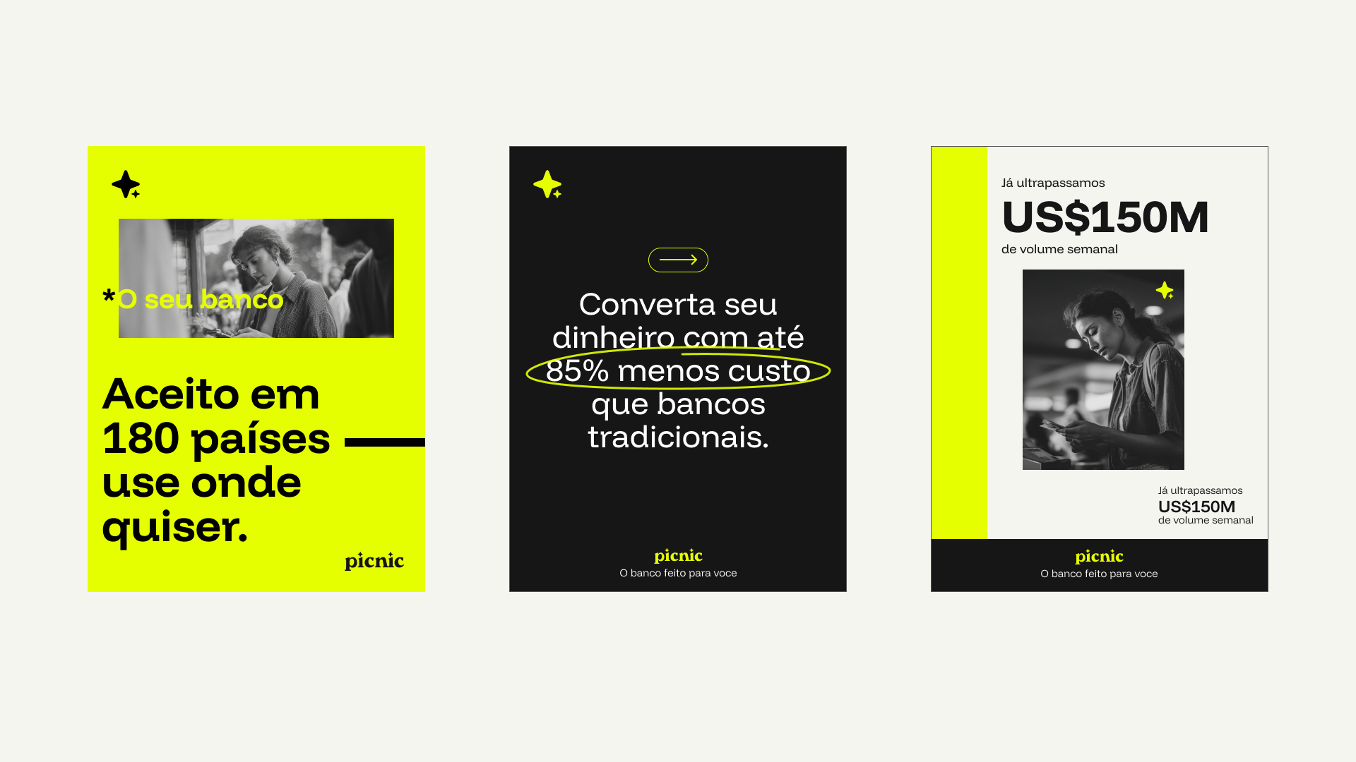
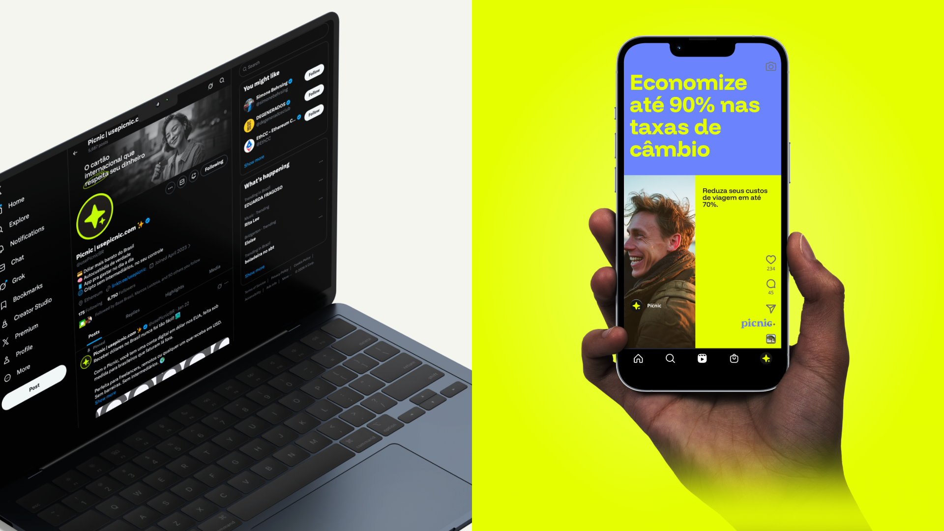
Scope covered social templates, email headers, in-app graphics, and campaign assets. The brand had to work at launch speed without a dedicated design resource on every post.
Picnic eliminates hidden fees from international spending, but without a visual system, social, campaigns, and in-app graphics each got interpreted differently.
The challenge: approachable and fresh, with fintech credibility, not corporate blue. The brand had to work at launch speed without a dedicated design resource on every post.
Benchmarked Nubank, Revolut, and Wise; aligned early with Head of Design Rafael Queiroz on priorities and approval workflows.
Templates became the primary teaching tool, not the guidelines PDF. Every asset was built so marketers could ship on-brand without designer dependency.
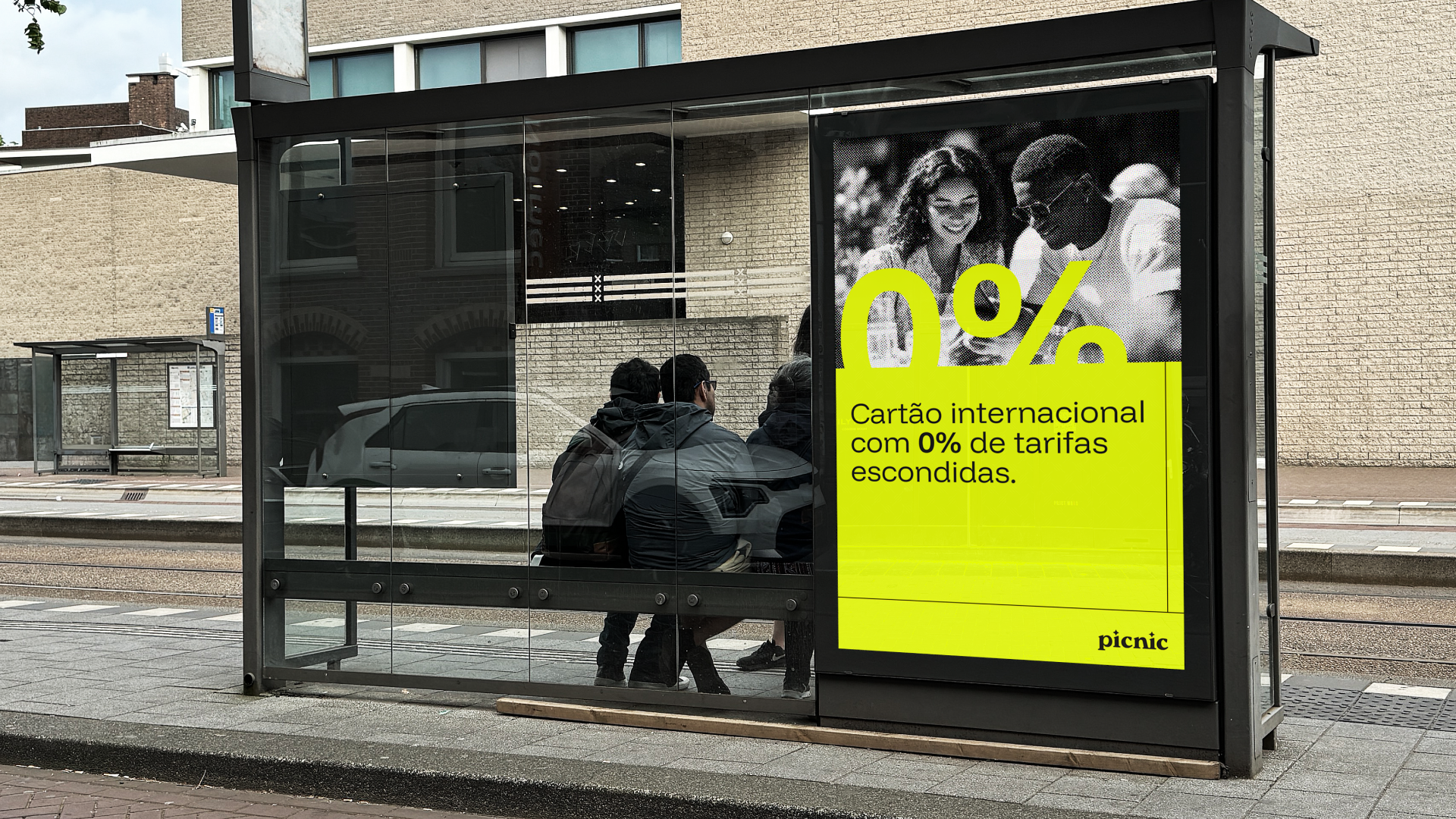
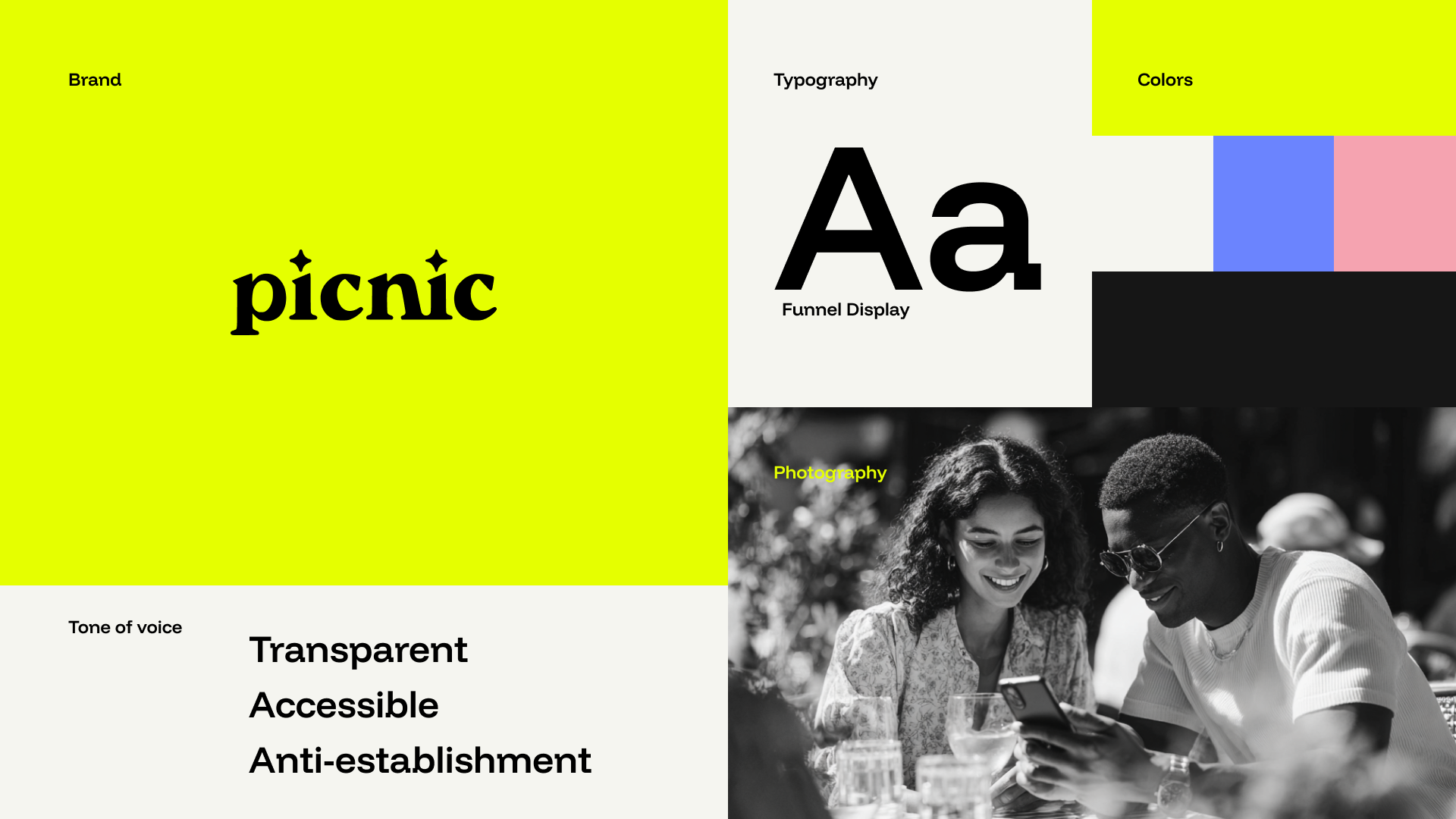
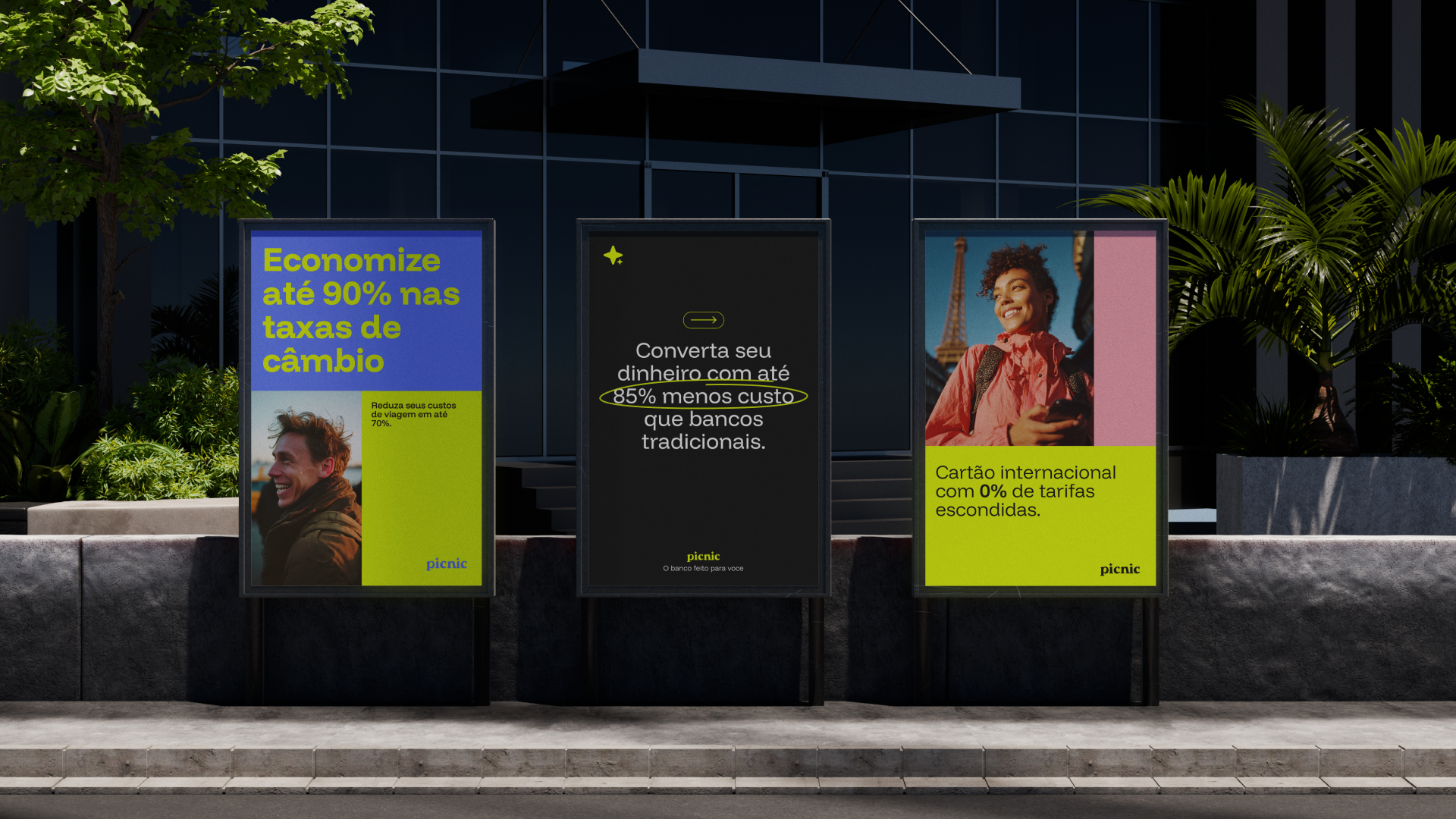
Flexible compositions, patterns, and graphic elements that work across social, email, in-app, and campaigns. Examples show how to apply the system, not just read about it.
We considered traditional bank aesthetics for trust. Cold blues and stock imagery felt generic. We chose warmth balanced with fintech credibility for international transactions.
We considered a guidelines-first rollout. Teams couldn’t apply theory without examples. We chose social templates, email headers, and in-app graphics as the primary teaching tool.
We considered one-off campaign designs. That created designer dependency. We chose scalable guidelines marketers and designers could run independently.
Complete Key Visual system and guidelines shipped for the launch deadline, covering social, in-app, email, and campaign touchpoints. The team could run autonomously from day one instead of waiting on design for every asset.
Templates reduced social design time and improved cross-channel consistency. Rafael Queiroz, Head of Design, validated the outcome: “His ability to understand not just what we needed, but why we needed it, made all the difference.”
Fintech brands don’t have to look like banks. Systems beat one-off designs, especially when a lean team needs to ship across channels without a designer on every asset.
Next: Motion guidelines for video and social; extend the Key Visual system into in-app experiences.