FOOD & BEVERAGE · BRAND IDENTITY

NØRA needed to stand out in a sea of generic bakery visuals

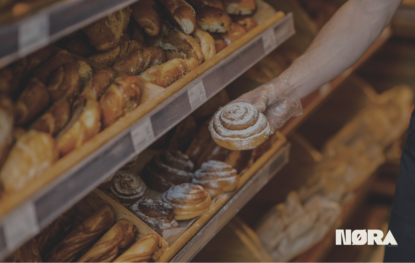
NØRA brand identity cover
CLIENTNØRA
MY ROLEBrand Designer
TIMELINE2025
ProblemCompetitive local market with generic bakery visuals. Needed craft authenticity without clichés.
ApproachCraft-centric identity: earth tones, custom type, sensory textures from packaging to digital.
OutcomeStrong visual reception, increased landing engagement, scalable system across digital, print, and physical.

Another bakery wasn’t an option

A vegan, Scandinavian-inspired bakery in a market of generic visuals. Craft authenticity without bakery clichés. Digital had to carry the same tactile sincerity as the physical brand, not just represent it from a distance.

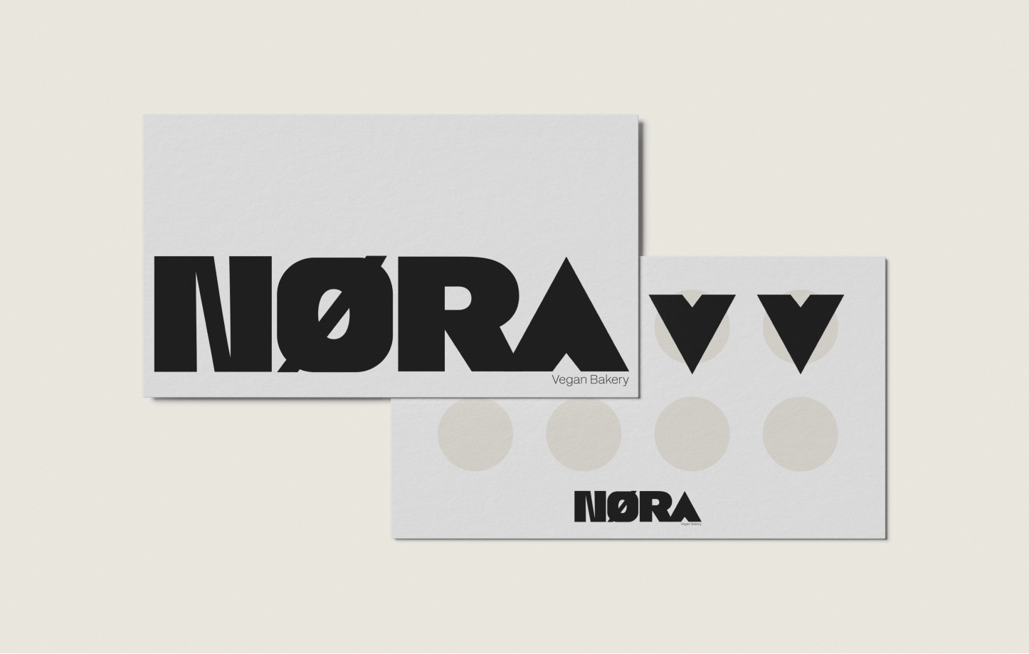
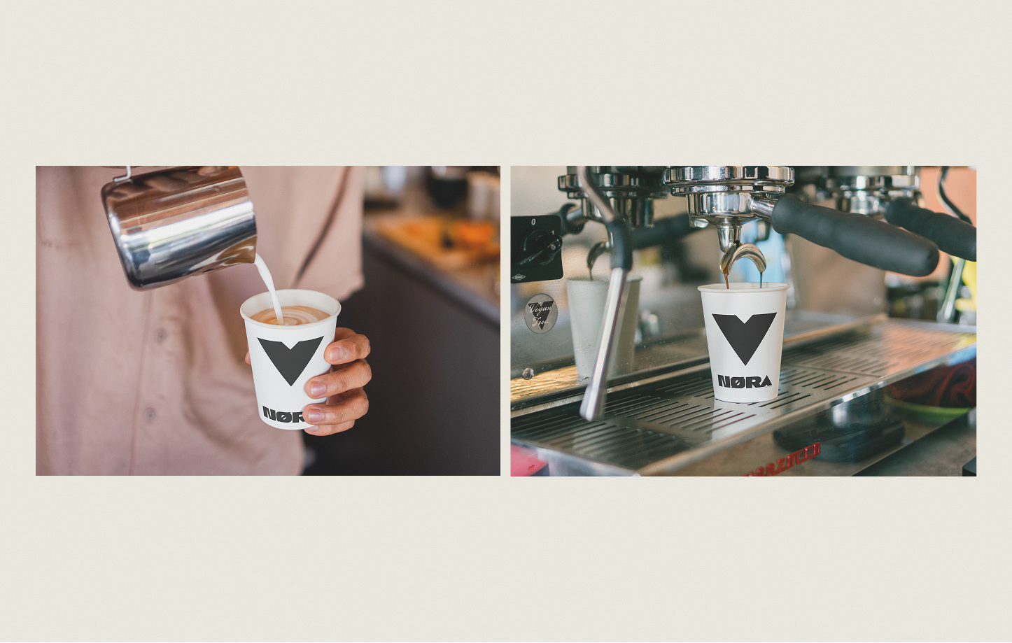
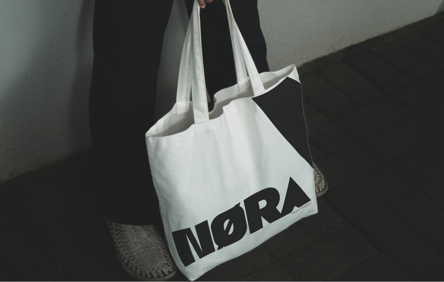
Deliverables spanned identity, brand narrative, landing page, and packaging direction. The system had to feel premium and vegan without leaning on the usual green-and-leaf tropes.

Premium food brands live or die on sensory trust

In a category where every competitor shows the same pastry photography, how the brand feels online becomes the differentiator before anyone walks through the door.

NØRA needed digital to feel as warm and intentional as the bakery itself. Texture, pacing, and narrative flow had to carry the same sincerity as signage and packaging.

Sensory research before visual exploration

Sensory branding research on how imagery and color evoke smell, taste, and feel, before visual exploration.

Competitors showed pastries; NØRA needed to evoke being in the bakery. Heritage cues plus modern clarity, built modular for menus, events, and seasonal drops.

Craft-centric storytelling with sensory resonance

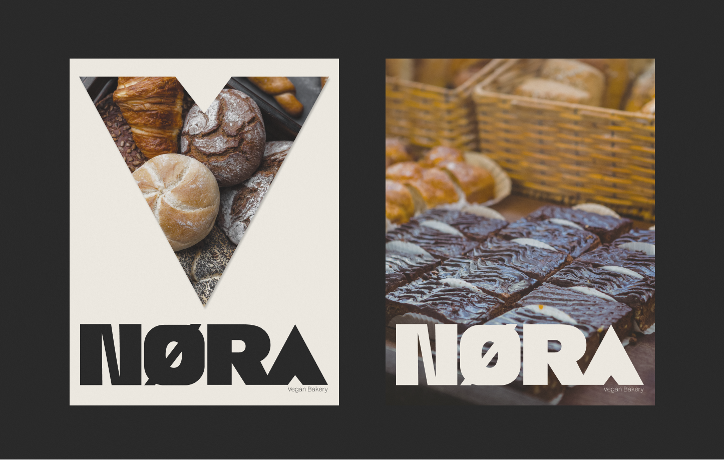
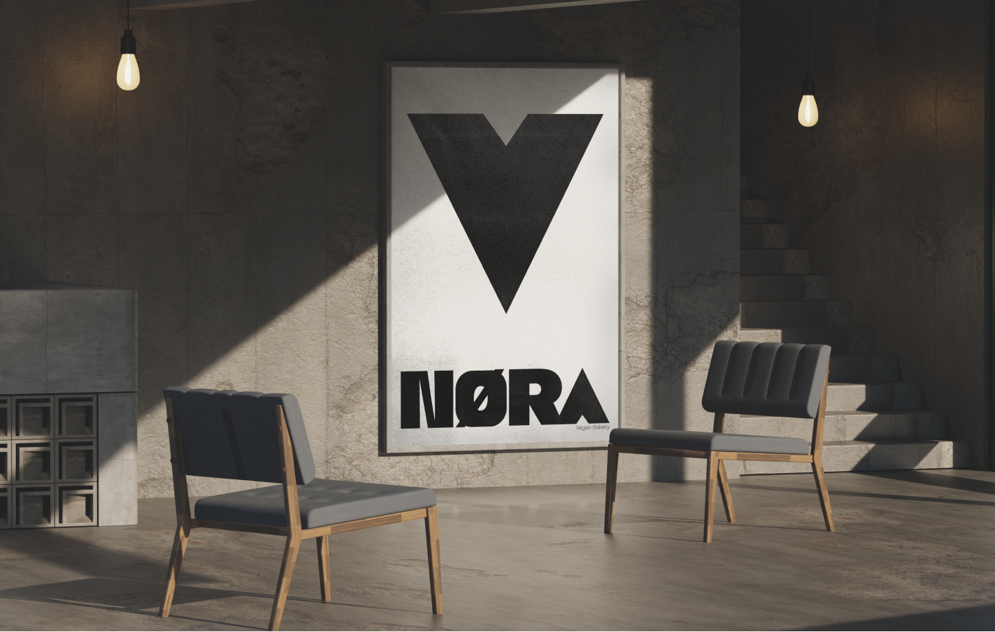
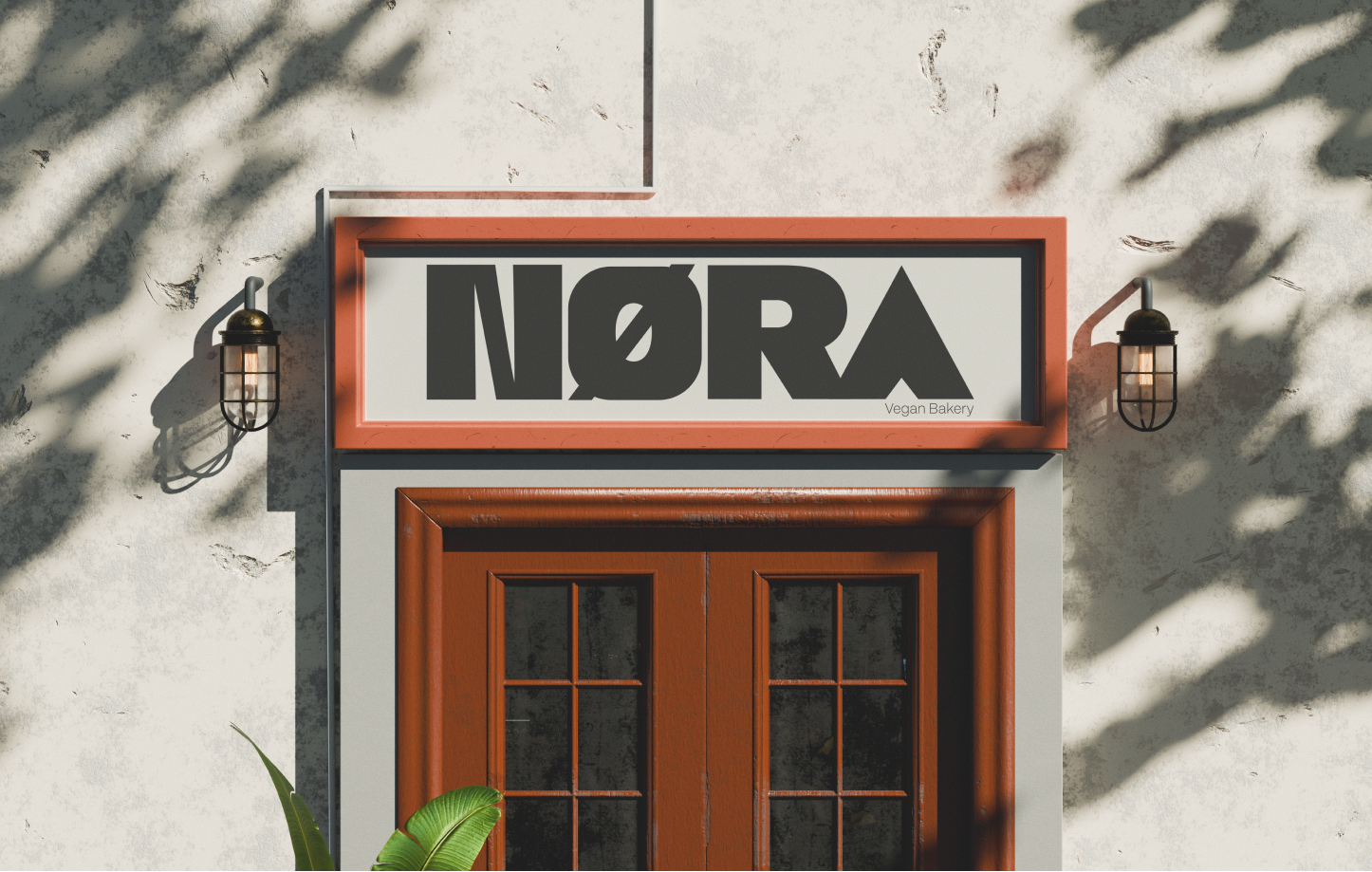
Earth tones, custom typography, textures like linen and woodgrain under natural light. A visual system that balances warmth and refined simplicity, flexible across digital, print, and physical environments.

Three tradeoffs that defined NØRA

Sensory storytelling over product shots alone

We considered product-only photography for clarity. Competitors all looked the same. We chose imagery and color that evoke smell, taste, and texture.

Heritage cues with modern restraint

We considered heavy rustic styling for craft signal. It felt dated online. We chose artisanal culture informed by clean typography and contemporary grids.

Digital that feels physical

We considered a standard marketing landing page. It felt disconnected from the brand. We chose texture, pacing, and narrative flow that carry the same warmth as the bakery itself.

A brand that feels real, not generic

Consistent praise for warmth and premium feeling from early users and clients. The identity differentiated NØRA from generic bakery templates without relying on product-only photography or rustic clichés.

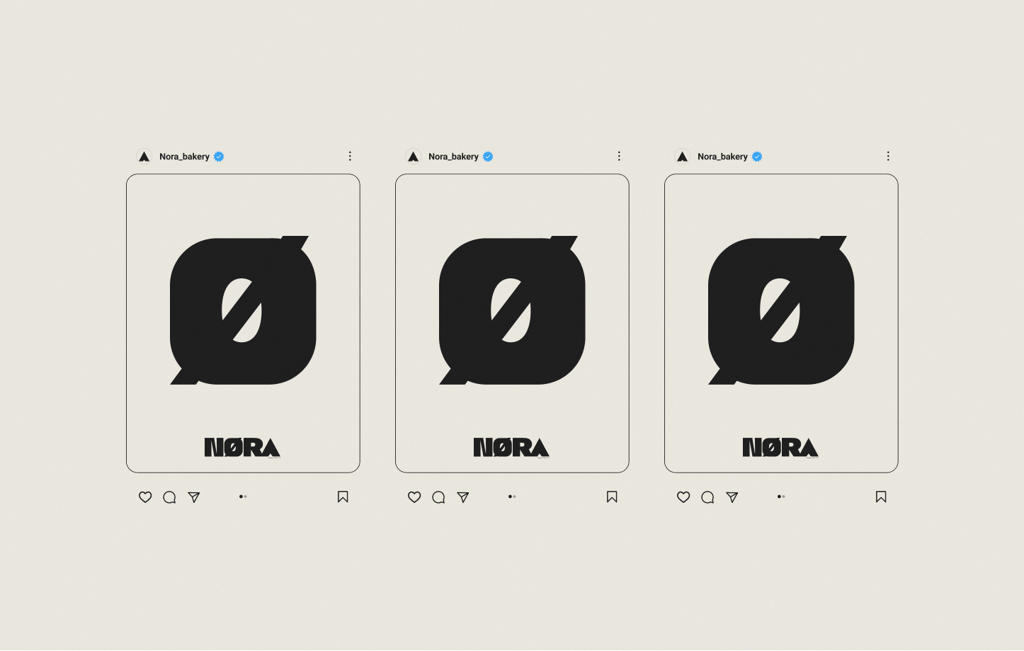
Soft engagement signals pointed in the right direction: longer scroll depth and time on page vs. generic bakery templates. The modular system now works across digital, print, and physical environments, ready for menus, events, and seasonal drops.

What I’d carry forward

In premium food brands, digital must feel like the physical brand, not just represent it. Texture, pacing, and narrative flow carry the same warmth as the bakery itself.

Next: Physical packaging from the mood direction; seasonal campaign templates using the established system.