LUXURY · BRAND IDENTITY
High craftsmanship and minimalist perfection with a dark, contemplative voice. Premium positioning without ornamentation, dark romance not gothic cliché, across identity, packaging, and digital.
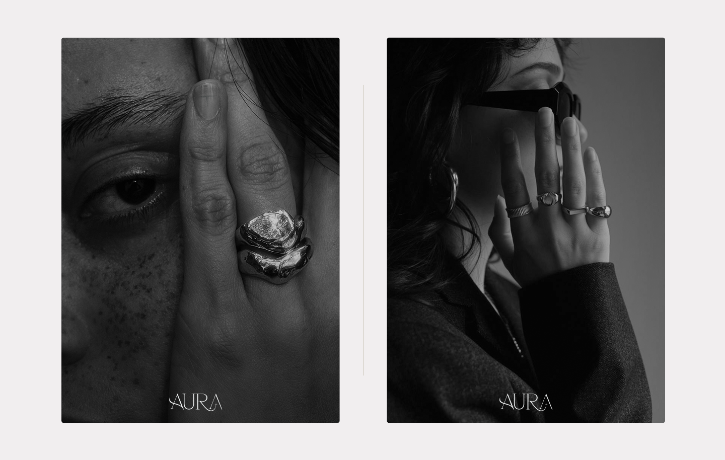
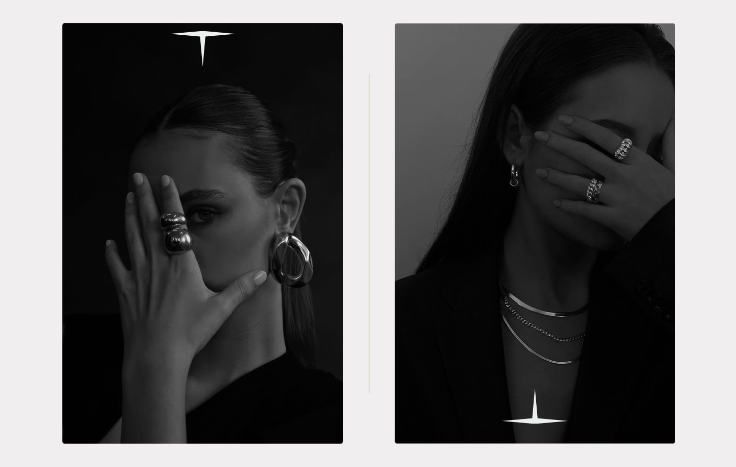
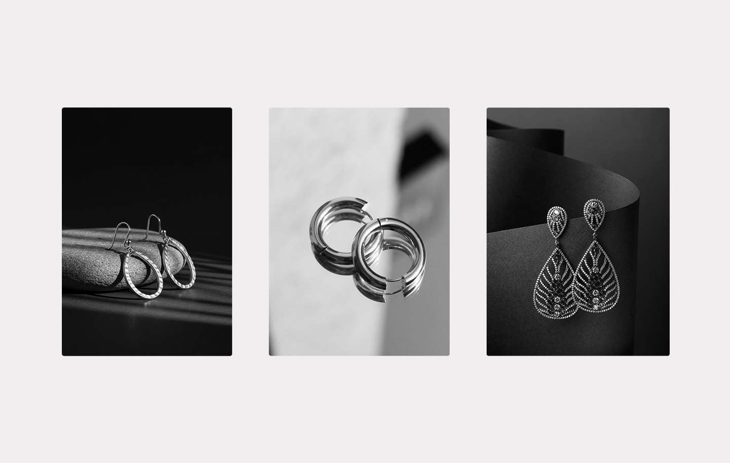
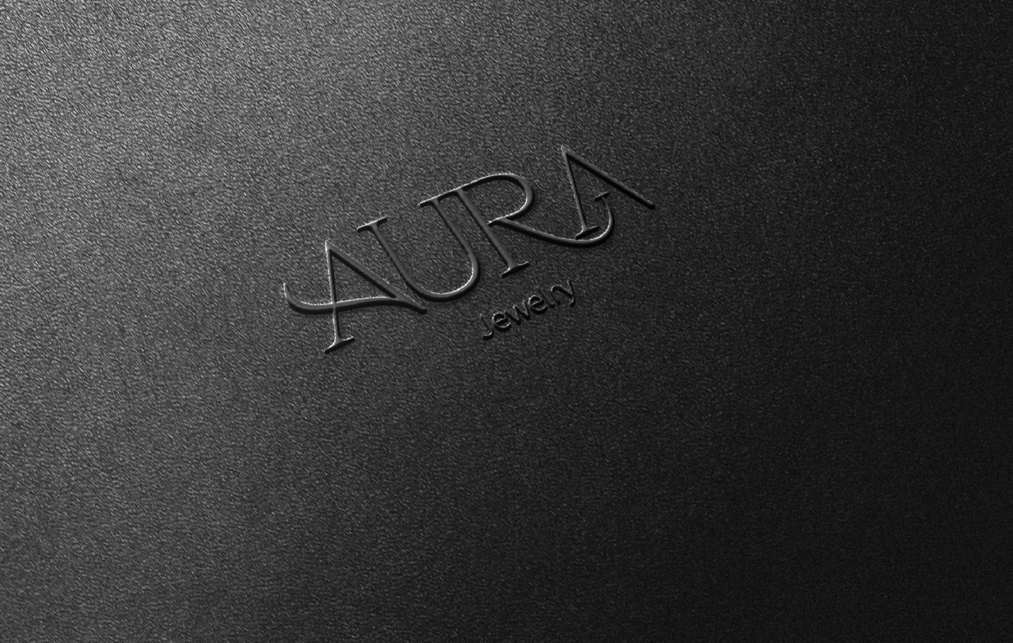
Luxury jewelry branding often leans on decorative excess. AURA needed to signal premium quality through restraint: contrast, negative space, and a signature mark that feels poised rather than ornate.
Premium jewelry buyers scan for credibility in seconds. Ornamentation signals tradition, but it also signals predictable category clichés.
AURA needed to signal premium quality through restraint: contrast, negative space, and a signature mark that feels poised rather than ornate.
Mapped where traditional jewelry branding felt decorative or predictable, and where minimalist competitors lacked the dark sensibility AURA needed.
The opportunity: contemplative luxury, craftsmanship with an edge. Restraint, contrast, and impact through simplicity, built for future product lines.
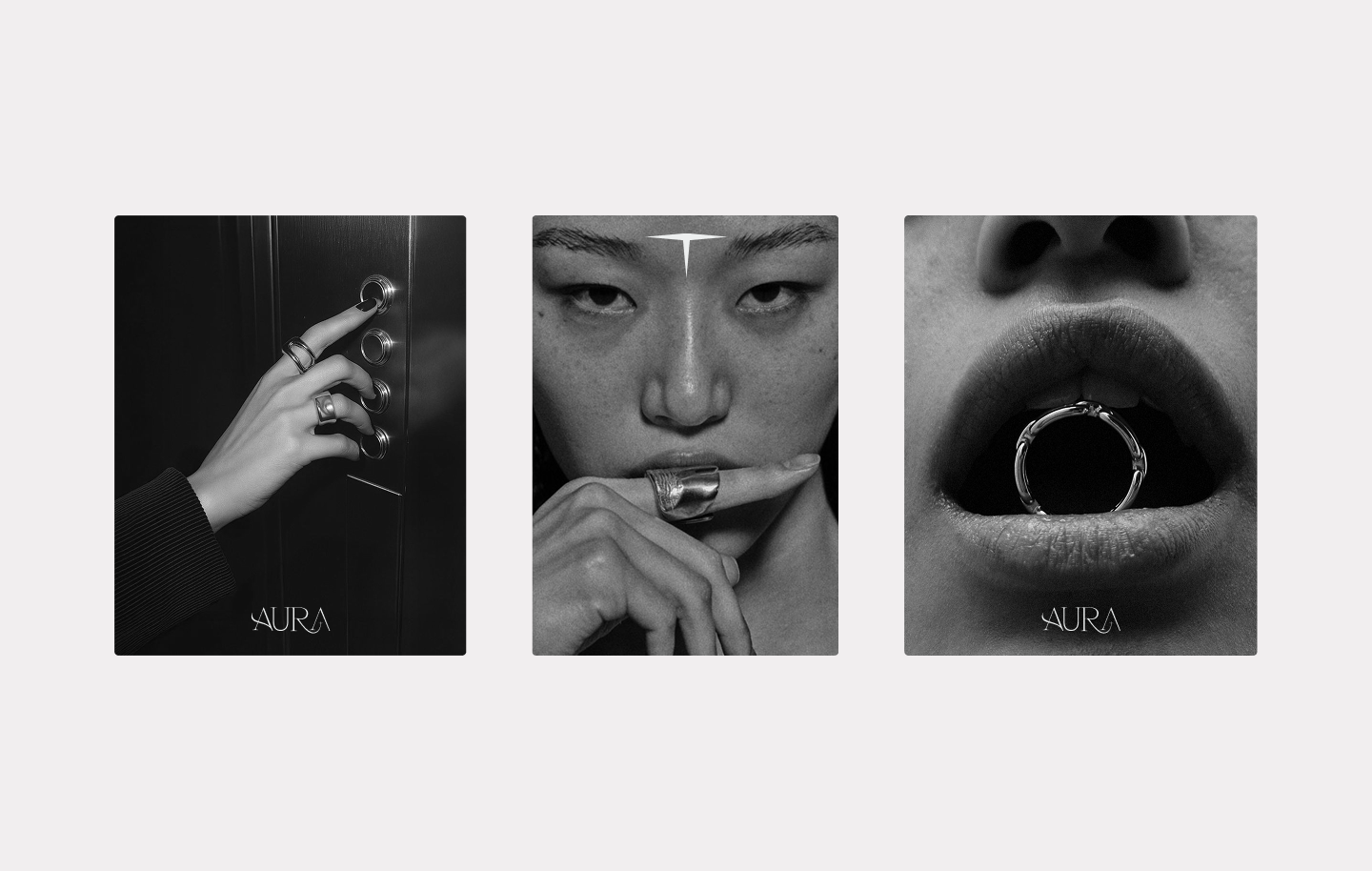
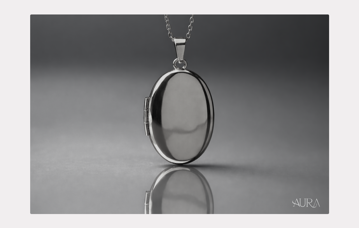
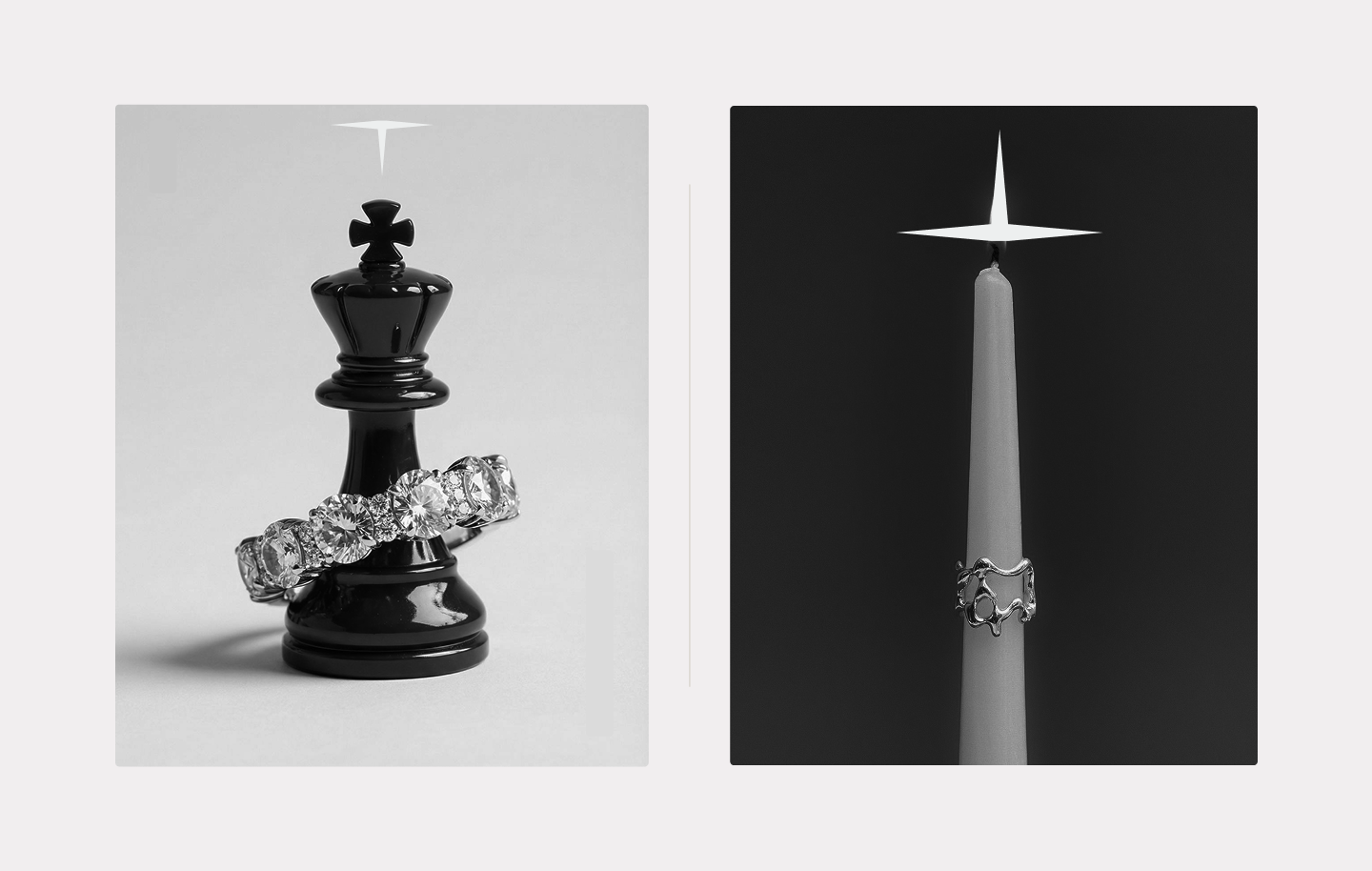
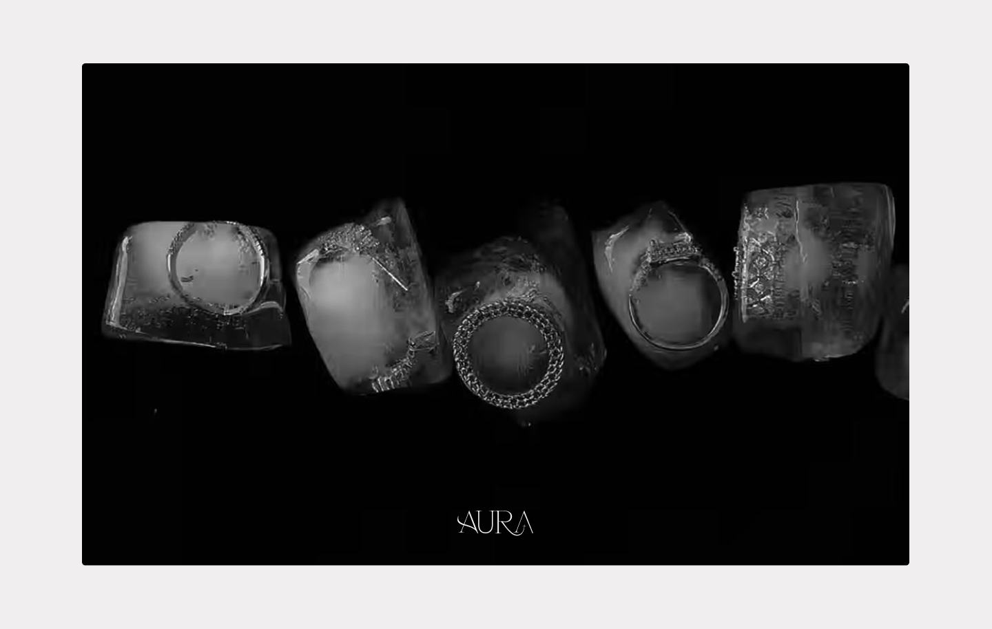
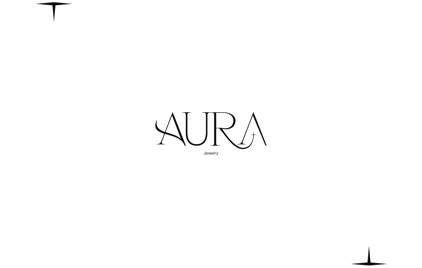
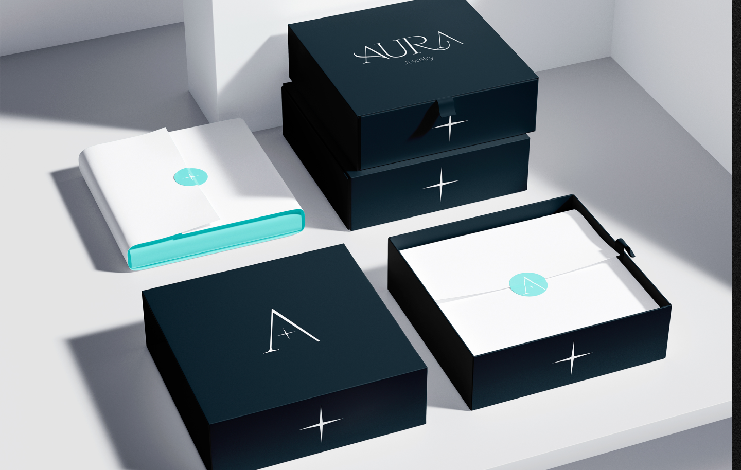
Dark palette, high-contrast typography, generous negative space, and a signature mark that feels poised and restrained. Luxury through simplicity. Contrast and space do the work decoration used to.


We considered decorative luxury cues for premium signal. Ornamentation diluted the dark, contemplative positioning. We chose simplicity: every element earns its place.
We considered dramatic gothic tropes for edge. Predictable jewelry clichés followed. We chose rich tones and shadow that signal premium quality through depth, not drama.
We considered dense compositions to showcase craft. Product focus suffered. We chose generous space that elevates the piece and reinforces minimalism.
Clear differentiation from traditional jewelry branding in a crowded luxury segment. The dark, contemplative system reads premium without relying on ornate cues or gothic clichés.
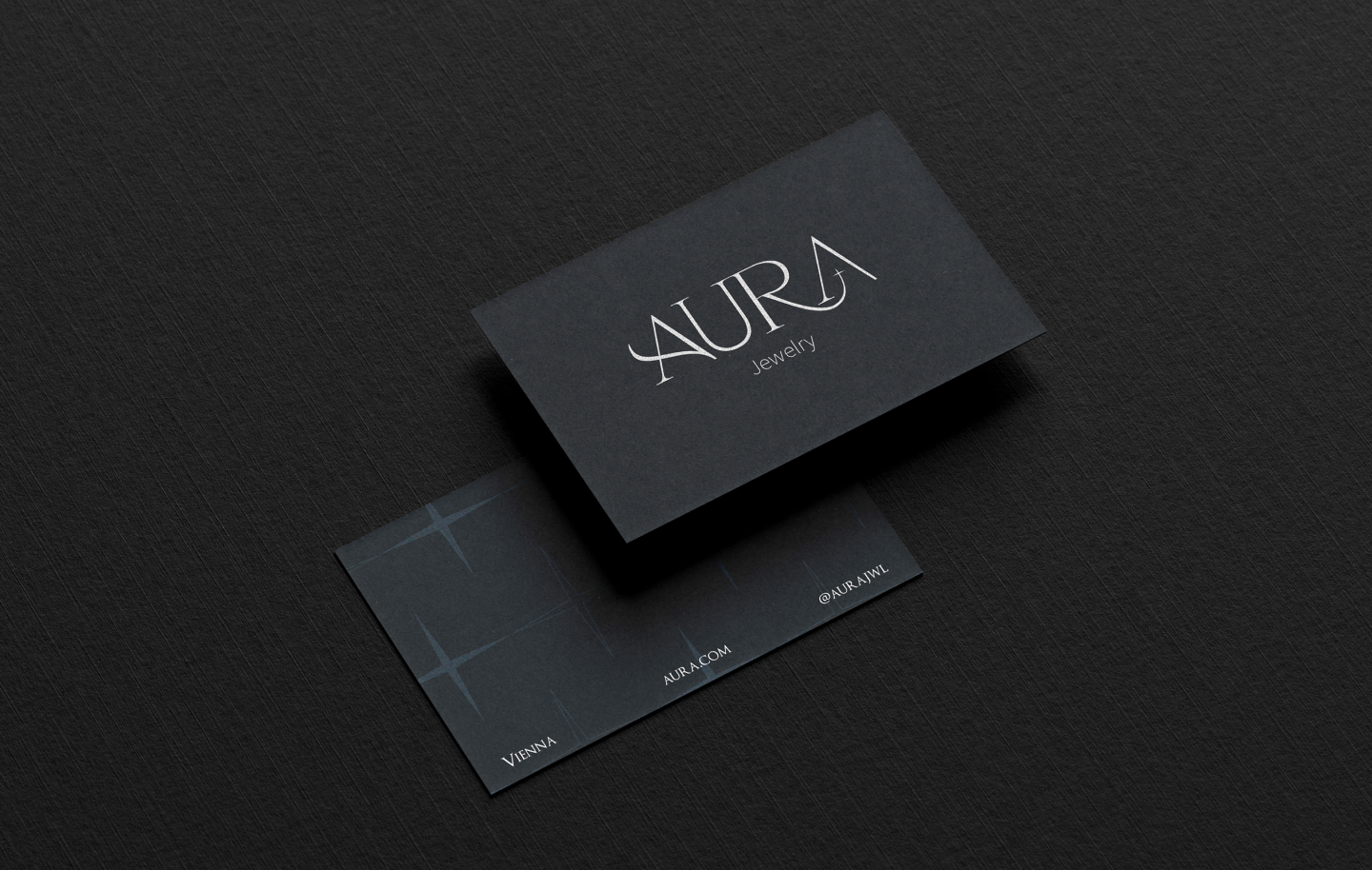
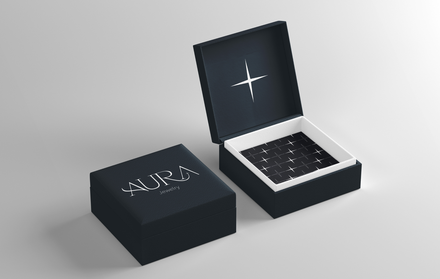
Visual foundation built for longevity across 4 touchpoints: identity, packaging, digital, and editorial. Refined positioning holds across seasonal campaigns and future product lines without redesigning from scratch.
In luxury branding, what you leave out communicates as much as what you include. Restraint isn’t minimalism for its own sake. It’s making every remaining element earn its place.
Next: E-commerce layouts that maintain the dark tone; seasonal campaign assets from the flexible identity system.